タイピング効果を実現するピュアhtml+css
2022-01-21 14:53:52
この記事では、特定の参照値と、タイピング効果を達成するために純粋なHTML + CSSを紹介し、知ることに興味がある
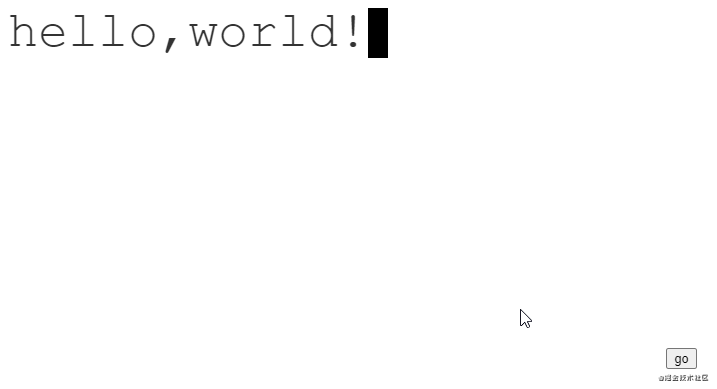
効果
分析
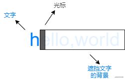
このアニメーションは、3つのレベルに分けて見ることができます。
- 最下層のテキスト
- テキストをブロックしている中央の背景
- 最上部のカーソル
テキストは静的、中央の背景と最上部のカーソルは動的です。
初期状態では、背景がすべてのテキストをブロックし、カーソルは左端にあります。
アニメーションが進むと、背景とカーソルが同じ速度で左から右へ移動します。
アニメーションの最後には、背景がテキストを隠さなくなり、カーソルが右端で点滅します。
コード
html
<div class="text">hello,world!</div>
css
:root {
    /* number of characters */
    --steps: 12;
    /* animation time */
    --duration: 2.5s;
    /* Font size */
    --fontSize: 50px;
    /* cursor size */
    --cursorSize: 20px;
}

.text {
    color: #333;;
    position: relative;
    display: inline-block;
    font-family: 'Courier New', Courier, monospace;
    font-size: var(--fontSize);
    line-height: 1;
}

.text::after {
    content: '';
    width: var(--cursorSize);
    height: var(--fontSize);
    background-color: black;
    z-index: 2;
    position: absolute;
    animation: blink 1s var(--duration) step-end infinite,
               moveCursor var(--duration) steps(var(--steps)) forwards;
}

.text::before {
    content: '';
    width: 100%;
    height: var(--fontSize);
    z-index: 1;
    position: absolute;
    background: linear-gradient(#fff, #fff) no-repeat top right;
    animation: showText var(--duration) steps(var(--steps)) forwards;
}

/* cursor blink animation */
@keyframes blink {
    0% {
        background-color: black;
    }
    50% {
        background-color: transparent;
    }
    100% {
        background-color: black;
    }
}

/* cursor movement animation */
@keyframes moveCursor {
    0% {
        left: 0%;
    }
    100% {
        left: 100%;
    }
}

/* Background movement animation */
@keyframes showText {
    0% {
        background-size: 100% 100%;
    }
    100% {
        background-size: 0% 100%;
    }
}
備考
フォントの幅が同じであること。これは、カーソルが毎回移動する距離が、文字数/全幅によって決まるからです。
純粋なhtml+cssのタイピング効果についての記事です。もっと関連するhtml css typing effectの内容については、Script Houseの過去の記事を検索するか、下記の関連記事を引き続き閲覧してください。
関連
-
指定した行の無線ラジオボックスをチェックし、その行までスクロールするLayuiフォームの実装コード
-
html+css implement picture upper right corner with delete fork, picture delete button.
-
htmlのドラッグ&ドロップによるコンテンツ位置の2つの実装方法
-
ダブル11クーポンのHTML実装(クーポンページを開くまでの時間設定)
-
html body タグと html common control タグ
-
Framesetのワイドスクリーン・センターリングを使用するためのヒントを共有する。
-
各ブラウザのhrタグに関する注意点
-
フォームフォームにおけるmethod=post/getとデータ転送の違いについて
-
XHTML文書におけるJavaScriptとCSSの適切な使用方法
-
ブラウザーのURLの前に小さなアイコンを表示させる方法
最新
-
nginxです。[emerg] 0.0.0.0:80 への bind() に失敗しました (98: アドレスは既に使用中です)
-
htmlページでギリシャ文字を使うには
-
ピュアhtml+cssでの要素読み込み効果
-
純粋なhtml + cssで五輪を実現するサンプルコード
-
ナビゲーションバー・ドロップダウンメニューのHTML+CSSサンプルコード
-
タイピング効果を実現するピュアhtml+css
-
htmlの選択ボックスのプレースホルダー作成に関する質問
-
html css3 伸縮しない 画像表示効果
-
トップナビゲーションバーメニュー作成用HTML+CSS
-
html+css 実装 サイバーパンク風ボタン