Python (Pandas)で積み上げ棒のクラスタを持つ方法
質問
私のデータセットがどのようなものであるかは、以下の通りです。
In [1]: df1=pd.DataFrame(np.random.rand(4,2),index=["A","B","C","D"],columns=["I","J"])

In [2]: df2=pd.DataFrame(np.random.rand(4,2),index=["A","B","C","D"],columns=["I","J"])

In [3]: df1
Out[3]:
          I         J
A  0.675616  0.177597
B  0.675693  0.598682
C  0.631376  0.598966
D  0.229858  0.378817

In [4]: df2
Out[4]:
          I         J
A  0.939620  0.984616
B  0.314818  0.456252
C  0.630907  0.656341
D  0.020994  0.538303
各データフレームについて積み上げ棒グラフを作成したいのですが、同じインデックスを持っているので、インデックスごとに2つの積み上げ棒グラフを作成したいです。
同じ軸に両方をプロットしようとしました。
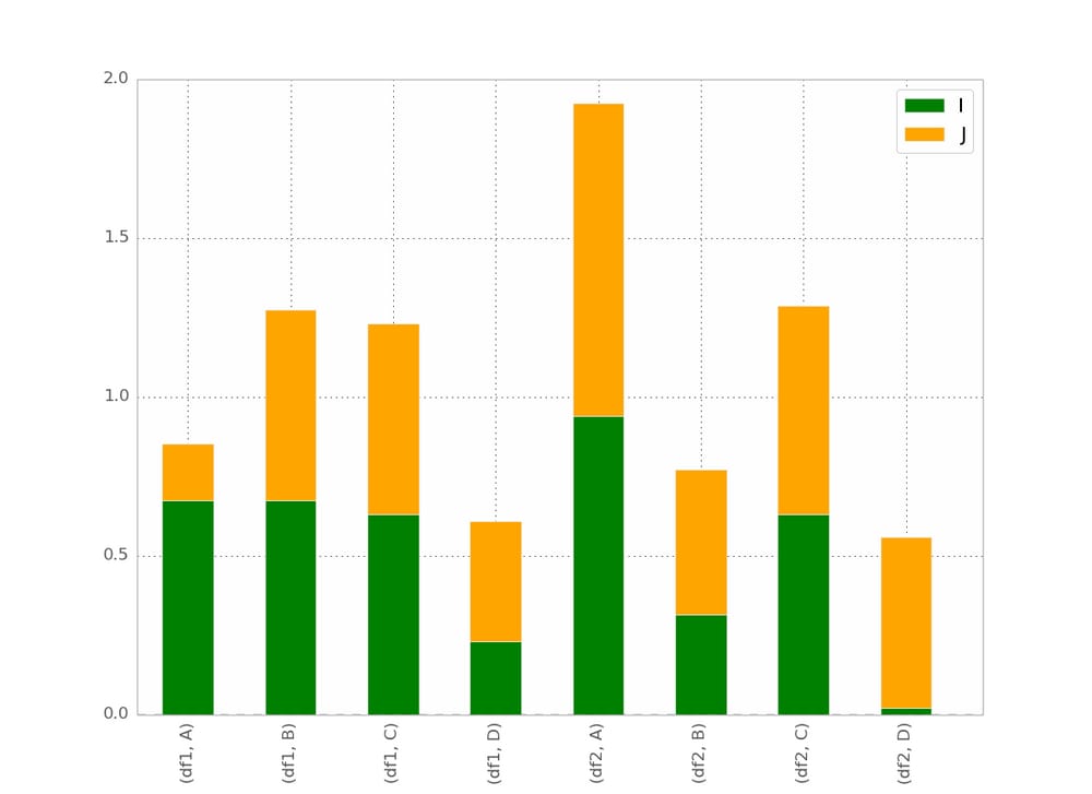
In [5]: ax = df1.plot(kind="bar", stacked=True)

In [5]: ax2 = df2.plot(kind="bar", stacked=True, ax = ax)
でも重なります。
そこで、まず2つのデータセットを連結してみました。
pd.concat(dict(df1 = df1, df2 = df2),axis = 1).plot(kind="bar", stacked=True)
しかし、ここではすべてが積み重なっています。
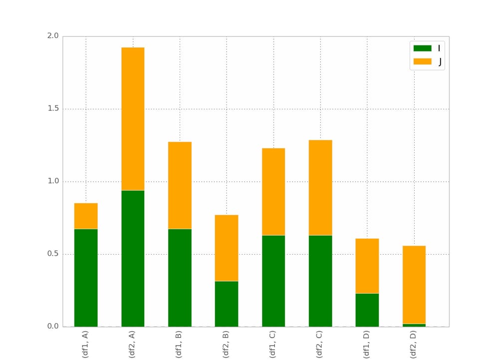
私の最高の試みは:
pd.concat(dict(df1 = df1, df2 = df2),axis = 0).plot(kind="bar", stacked=True)
ということになります。
これは基本的に私が望むものですが、バーの順序を
(df1,A) (df2,A) (df1,B) (df2,B) など...
何かコツがありそうなのですが、見つかりません
bgschillerの回答の後、私はこれを得た。
というのが、ほぼ私の希望です。私は、バーを インデックスによってクラスタリングされた であり、視覚的に明確なものを持つために。
ボーナス : x-labelが冗長にならないように、次のようなものを用意します。
df1 df2    df1 df2
_______    _______ ...
   A          B
ご協力ありがとうございました。
どのように解決するのですか?
私は最終的にトリックを見つけました(編集:seabornとlongform dataframeの使用については以下を参照してください)。
pandasとmatplotlibを使った解決法
より完全な例はこちらです。
import pandas as pd
import matplotlib.cm as cm
import numpy as np
import matplotlib.pyplot as plt

def plot_clustered_stacked(dfall, labels=None, title="multiple stacked bar plot",  H="/", **kwargs):
    """Given a list of dataframes, with identical columns and index, create a clustered stacked bar plot.
labels is a list of the names of the dataframe, used for the legend
title is a string for the title of the plot
H is the hatch used for identification of the different dataframe"""

    n_df = len(dfall)
    n_col = len(dfall[0].columns)
    n_ind = len(dfall[0].index)
    axe = plt.subplot(111)

    for df in dfall : # for each data frame
        axe = df.plot(kind="bar",
                      linewidth=0,
                      stacked=True,
                      ax=axe,
                      legend=False,
                      grid=False,
                      **kwargs)  # make bar plots

    h,l = axe.get_legend_handles_labels() # get the handles we want to modify
    for i in range(0, n_df * n_col, n_col): # len(h) = n_col * n_df
        for j, pa in enumerate(h[i:i+n_col]):
            for rect in pa.patches: # for each index
                rect.set_x(rect.get_x() + 1 / float(n_df + 1) * i / float(n_col))
                rect.set_hatch(H * int(i / n_col)) #edited part
                rect.set_width(1 / float(n_df + 1))

    axe.set_xticks((np.arange(0, 2 * n_ind, 2) + 1 / float(n_df + 1)) / 2.)
    axe.set_xticklabels(df.index, rotation = 0)
    axe.set_title(title)

    # Add invisible data to add another legend
    n=[]
    for i in range(n_df):
        n.append(axe.bar(0, 0, color="gray", hatch=H * i))

    l1 = axe.legend(h[:n_col], l[:n_col], loc=[1.01, 0.5])
    if labels is not None:
        l2 = plt.legend(n, labels, loc=[1.01, 0.1])
    axe.add_artist(l1)
    return axe

# create fake dataframes
df1 = pd.DataFrame(np.random.rand(4, 5),
                   index=["A", "B", "C", "D"],
                   columns=["I", "J", "K", "L", "M"])
df2 = pd.DataFrame(np.random.rand(4, 5),
                   index=["A", "B", "C", "D"],
                   columns=["I", "J", "K", "L", "M"])
df3 = pd.DataFrame(np.random.rand(4, 5),
                   index=["A", "B", "C", "D"],
                   columns=["I", "J", "K", "L", "M"])

# Then, just call :
plot_clustered_stacked([df1, df2, df3],["df1", "df2", "df3"])
そして、それはそれを与える:
バーの色は
cmap
引数を渡すことで変更できます。
plot_clustered_stacked([df1, df2, df3],
                       ["df1", "df2", "df3"],
                       cmap=plt.cm.viridis)
シーボーンで解決。
以下のような同じdf1, df2, df3が与えられたとき、それらを長い形式に変換します。
df1["Name"] = "df1"
df2["Name"] = "df2"
df3["Name"] = "df3"
dfall = pd.concat([pd.melt(i.reset_index(),
                           id_vars=["Name", "index"]) # transform in tidy format each df
                   for i in [df1, df2, df3]],
                   ignore_index=True)
seabornの問題は、ネイティブでバーを積み重ねられないことです。そのため、各バーの累積和を互いに重ねてプロットするトリックがあります。
dfall.set_index(["Name", "index", "variable"], inplace=1)
dfall["vcs"] = dfall.groupby(level=["Name", "index"]).cumsum()
dfall.reset_index(inplace=True)

>>> dfall.head(6)
  Name index variable     value       vcs
0  df1     A        I  0.717286  0.717286
1  df1     B        I  0.236867  0.236867
2  df1     C        I  0.952557  0.952557
3  df1     D        I  0.487995  0.487995
4  df1     A        J  0.174489  0.891775
5  df1     B        J  0.332001  0.568868
次に、各グループをループして
variable
をループし、累積和をプロットします。
c = ["blue", "purple", "red", "green", "pink"]
for i, g in enumerate(dfall.groupby("variable")):
    ax = sns.barplot(data=g[1],
                     x="index",
                     y="vcs",
                     hue="Name",
                     color=c[i],
                     zorder=-i, # so first bars stay on top
                     edgecolor="k")
ax.legend_.remove() # remove the redundant legends
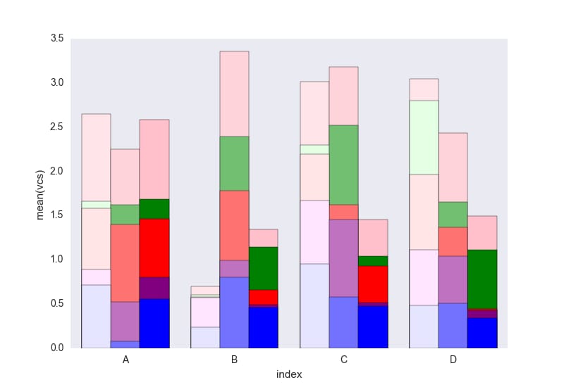
簡単に追加できる凡例が欠けていると思います。問題は、データフレームを区別するためのハッチ(簡単に追加できます)の代わりに、明るさのグラデーションを使用していることです。
コードの中で理解できないことがあれば教えてください。
このコードはCC0の下で自由に再利用してください。
関連
-
[解決済み] Pythonには文字列の'contains'サブストリングメソッドがありますか?
-
[解決済み] Pythonで現在時刻を取得する方法
-
[解決済み] Pythonで辞書に新しいキーを追加するにはどうすればよいですか?
-
[解決済み] PandasでDataFrameの行を反復処理する方法
-
[解決済み] Pythonで2つのリストを連結する方法は?
-
[解決済み] pipでPythonの全パッケージをアップグレードする方法
-
[解決済み】Pythonに三項条件演算子はありますか?
-
[解決済み] Django 1.7で初期マイグレーションからマイグレートバックする方法は?
-
[解決済み] PySparkでデータフレームのカラムをString型からDouble型に変更する方法は?
-
[解決済み] if 節の終了方法
最新
-
nginxです。[emerg] 0.0.0.0:80 への bind() に失敗しました (98: アドレスは既に使用中です)
-
htmlページでギリシャ文字を使うには
-
ピュアhtml+cssでの要素読み込み効果
-
純粋なhtml + cssで五輪を実現するサンプルコード
-
ナビゲーションバー・ドロップダウンメニューのHTML+CSSサンプルコード
-
タイピング効果を実現するピュアhtml+css
-
htmlの選択ボックスのプレースホルダー作成に関する質問
-
html css3 伸縮しない 画像表示効果
-
トップナビゲーションバーメニュー作成用HTML+CSS
-
html+css 実装 サイバーパンク風ボタン
おすすめ
-
[解決済み] seabornを使ってDataFrameの積み上げ棒グラフを作成する方法 [重複]。
-
[解決済み] Jupyterノートブックでenv変数を設定する方法
-
[解決済み] Django のテストデータベースをメモリ上だけで動作させるには?
-
[解決済み] PythonからSMTPを使用してメールを送信する
-
[解決済み] python-requests モジュールからのすべてのリクエストをログに記録します。
-
[解決済み] 古いバージョンのPythonにおける辞書のキーの並び順
-
[解決済み] Pythonでマルチプロセッシングキューを使うには?
-
[解決済み] Cythonのコードを含むPythonパッケージはどのように構成すればよいのでしょうか?
-
[解決済み] PyQtアプリケーションのスレッド化。QtスレッドとPythonスレッドのどちらを使うか?
-
[解決済み] Flask でグローバル変数はスレッドセーフか?リクエスト間でデータを共有するには?