Python3dの描画 mpl_toolkits.mplot3d
2022-02-11 06:36:13
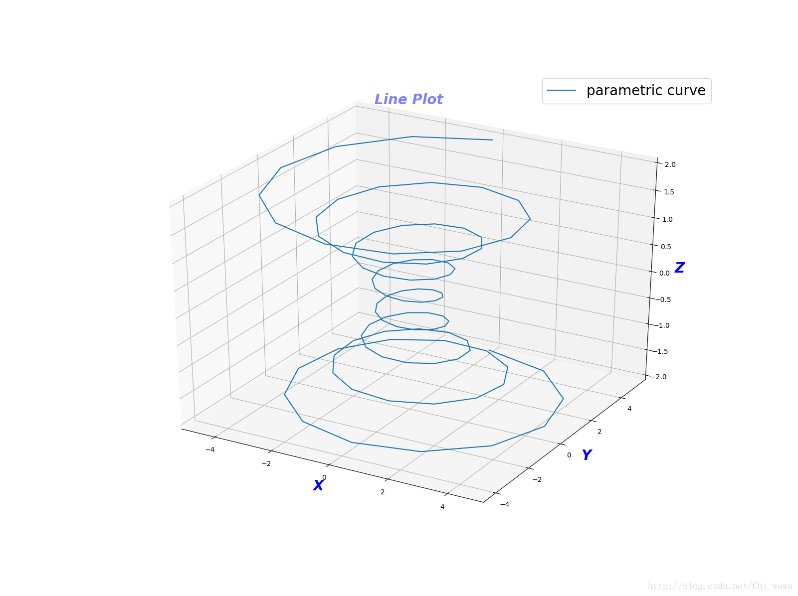
ラインプロット
# -*- coding: utf-8 -*-
import numpy as np
import matplotlib as mpl
import matplotlib.pyplot as plt
from mpl_toolkits.mplot3d import Axes3D

mpl.rcParams['legend.fontsize'] = 20 # mpl module loads the configuration information stored in the rcParams variable, the rc_params_from_file() function loads the configuration information from the file

font = {
    'color': 'b',
    'style': 'oblique',
    'size': 20,
    'weight': 'bold'
}
fig = plt.figure(figsize=(16, 12)) # parameter is the image size
ax = fig.gca(projection='3d') # get current axes, and the axes are in 3d

# prepare the data
theta = np.linspace(-8 * np.pi, 8 * np.pi, 100) # generate an equivariant series, [-8π,8π], number of 100
z = np.linspace(-2, 2, 100) # [-2,2] equivariant series of capacity 100, where the number must be consistent with theta, because the following operations are done with the corresponding elements
r = z ** 2 + 1
x = r * np.sin(theta) # [-5,5]
y = r * np.cos(theta) # [-5,5]
ax.set_xlabel("X", fontdict=font)
ax.set_ylabel("Y", fontdict=font)
ax.set_zlabel("Z", fontdict=font)
ax.set_title("Line Plot", alpha=0.5, fontdict=font) #alpha parameter means transparencytransparent
ax.plot(x, y, z, label='parametric curve')
ax.legend(loc='upper right') #legend position can be chosen: upper right/left/center,lower right/left/center,right,left,center,best etc.

plt.show()
<イグ
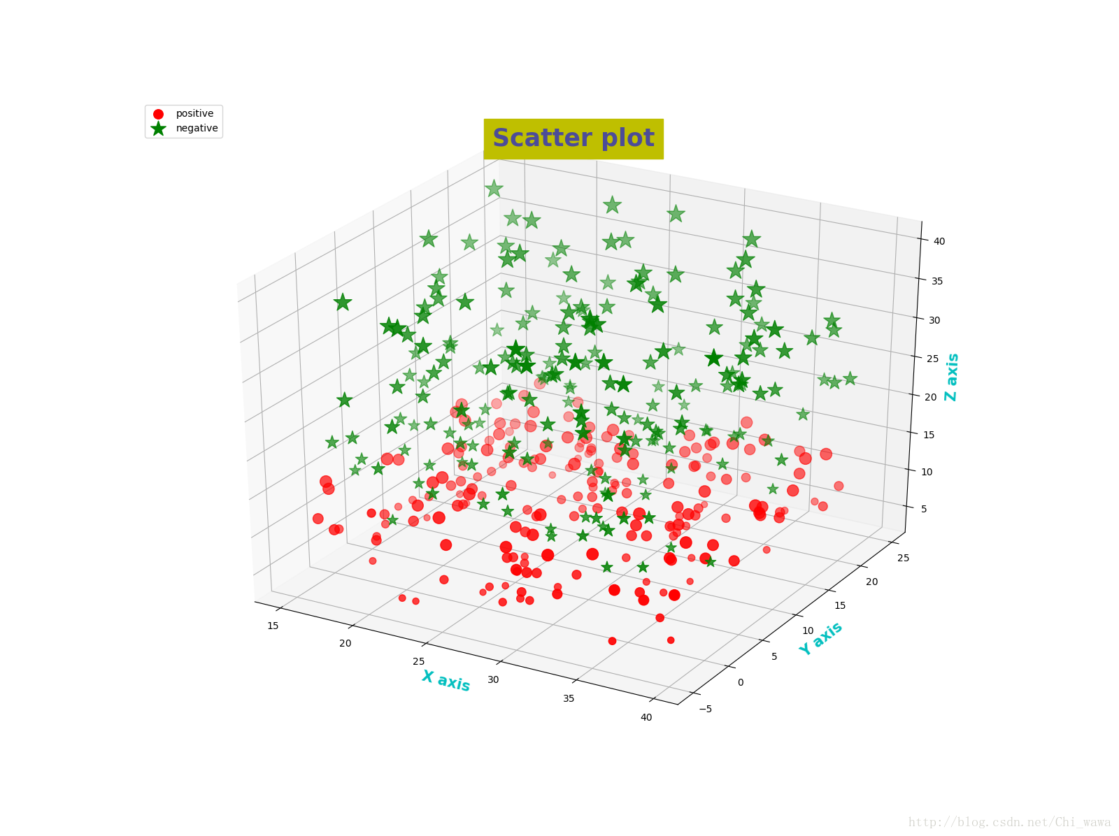
散布図
# -*- coding: utf-8 -*-
import numpy as np
import matplotlib as mpl
import matplotlib.pyplot as plt
from mpl_toolkits.mplot3d import Axes3D

label_font = {
    'color': 'c',
    'size': 15,
    'weight': 'bold'
}


def randrange(n, vmin, vmax):
    r = np.random.rand(n) # generate n random numbers between 0 and 1
    return (vmax - vmin) * r + vmin # get n random numbers between [vmin,vmax]


fig = plt.figure(figsize=(16, 12))
ax = fig.add_subplot(111, projection="3d") # add sub axes, 111 means the first subplot in 1 row and 1 column
n = 200
for zlow, zhigh, c, m, l in [(4, 15, 'r', 'o', 'positive'),
                             (13, 40, 'g', '*', 'negative')]: # with two tuples, is to distinguish the shape from the color
    x = randrange(n, 15, 40)
    y = randrange(n, -5, 25)
    z = randrange(n, zlow, zhigh)
    ax.scatter(x, y, z, c=c, marker=m, label=l, s=z * 10) # Here the size of the marker is proportional to the size of z

ax.set_xlabel("X axis", fontdict=label_font)
ax.set_ylabel("Y axis", fontdict=label_font)
ax.set_zlabel("Z axis", fontdict=label_font)
ax.set_title("Scatter plot", alpha=0.6, color="b", size=25, weight='bold', backgroundcolor="y") #title of subplot
ax.legend(loc="upper left") #legend's position top left

plt.show()
<イグ
サーフェスプロット
# -*- coding: utf-8 -*-
import numpy as np
import matplotlib.pyplot as plt
from mpl_toolkits.mplot3d import Axes3D
from matplotlib import cm
from matplotlib.ticker import LinearLocator, FormatStrFormatter

fig = plt.figure(figsize=(16,12))
ax = fig.gca(projection="3d")

# Prepare the data
x = np.range(-5, 5, 0.25) # generate [-5,5] interval of 0.25 series, the smaller the interval, the smoother the surface
y = np.range(-5, 5, 0.25)
x, y = np.meshgrid(x,y) # lattice matrix, the original x row vector is copied len(y) times down to form a len(y)*len(x) matrix, which is the new x matrix; the original y column vector is copied len(x) times to the right to form a len(y)*len(x) matrix, which is the new y matrix; the new x matrix and the new y matrix have the same shape
r = np.sqrt(x ** 2 + y ** 2)
z = np.sin(r)

surf = ax.plot_surface(x, y, z, cmap=cm.coolwarm) # cmap means color map

# Customize z-axis
ax.set_zlim(-1, 1)
ax.zaxis.set_major_locator(LinearLocator(20)) # the sparsity of the z-axis grid lines, the sparsity of the scale, 20 means the number of scales
ax.zaxis.set_major_formatter(FormatStrFormatter('%.02f')) # convert the value string of z to float, keeping 2 decimal places

# set the axis label and title
ax.set_xlabel('x',size=15)
ax.set_ylabel('y',size=15)
ax.set_zlabel('z',size=15)
ax.set_title("Surface plot", weight='bold', size=20)

# Add the right color bar
fig.colorbar(surf, shrink=0.6, aspect=8) # shrink means the overall shrinkage ratio, aspect only has an effect on the width of the bar, the larger the aspect value, the narrower the bar
plt.show()
<イグ
コンタープロット
# -*- coding: utf-8 -*-
from mpl_toolkits.mplot3d import axes3d
import matplotlib.pyplot as plt
from matplotlib import cm

fig = plt.figure(figsize=(16, 12))
ax = fig.add_subplot(111, projection='3d')
X, Y, Z = axes3d.get_test_data(0.05) # test data
cset = ax.contour(X, Y, Z, cmap=cm.coolwarm) #color map chosen is coolwarm
#cset = ax.contour(X, Y, Z,extend3d=True, cmap=cm.coolwarm)
ax.set_title("Contour plot", color='b', weight='bold', size=25)
plt.show()
次の2つのプロットは、extend3dプロパティを設定しない場合と、extend3dプロパティをTrueに設定した場合の等高線プロットをそれぞれ示しています。
# -*- coding: utf-8 -*-
import numpy as np
import matplotlib.pyplot as plt
from matplotlib import cm
from mpl_toolkits.mplot3d import axes3d

fig = plt.figure(figsize=(16, 12))
ax = fig.gca(projection="3d") # get current axis
X, Y, Z = axes3d.get_test_data(0.05) # test data

ax.plot_surface(X, Y, Z, rstride=3, cstride=3, alpha=0.3)
cset = ax.contour(X, Y, Z, zdir='z', offset=-100, cmap=cm.coolwarm)
cset = ax.contour(X, Y, Z, zdir="x", offset=-40, cmap=cm.coolwarm)
cset = ax.contour(X, Y, Z, zdir="y", offset=40, cmap=cm.coolwarm)

ax.set_xlabel('X')
ax.set_xlim(-40, 40)
ax.set_ylabel('Y')
ax.set_ylim(-40, 40)
ax.set_zlabel('Z')
ax.set_zlim(-100, 100)
ax.set_title('Contour plot', alpha=0.5, color='g', weight='bold', size=30)

plt.show()
<イグ
バープロット
# -*- coding: utf-8 -*-
import numpy as np
import matplotlib.pyplot as plt
from mpl_toolkits.mplot3d import Axes3D

fig = plt.figure(figsize=(16, 12))
ax = fig.add_subplot(111, projection="3d")
a = zip(['r', 'g', 'b', 'y'], [30, 20, 10, 0])
for c, z in a:
    xs = np.range(20) # the natural numbers between [0,20), 20 in total
    ys = np.random.rand(20) # generate 20 random numbers between [0,1
    cs = [c] * len(xs) # Generate a list of colors
    ax.bar(xs, ys, z, zdir='x', color=cs, alpha=0.8) # Take zdir='x' and specify the direction of z as the x-axis, then the x-axis takes the value [30,20,10,0]
# ax.bar(xs, ys, z, zdir='y', color=cs, alpha=0.8)
# ax.bar(xs, ys, z, zdir='z', color=cs, alpha=0.8)

ax.set_xlabel('X')
ax.set_ylabel('Y')
ax.set_zlabel('Z')
ax.set_title('Bar plot', size=25, weight='bold')
plt.show()
<イグ
2Dプロットを3Dで表示
# -*- coding: utf-8 -*-
import numpy as np
import matplotlib.pyplot as plt
from mpl_toolkits.mplot3d import Axes3D

fig = plt.figure(figsize=(16, 12))
ax = fig.gca(projection="3d")

# in the x-axis and y-axis drawing sin function
x = np.linspace(0, 1, 100)
y = np.sin(2 * np.pi * x) + 1 # 2*π*x∈[0,2π] y belongs to [0,2]
ax.plot(x, y, zs=0, zdir='z', label="sin curve in (x,y)")

colors = ('r', 'g', 'b', 'k')
x = np.random.sample(20 * len(colors))
y = np.random.sample(20 * len(colors))
c_list = []
for c in colors:
    c_list.append([c] * 20) # For example, the result of [colors[0]*5] is ['r','r','r','r','r','r'], a list
ax.scatter(x, y, zs=0, zdir='y', c=c_list, label="scatter points in (x,z)")

ax.legend()
ax.set_xlim(0, 1)
ax.set_ylim(0, 2)
ax.set_zlim(0, 1)
ax.set_xlabel("X")
ax.set_ylabel("Y")
ax.set_zlabel("Z")

ax.view_init(elev=20, azim=25) # Adjust the display angle of the axes
plt.show()
<イグ
サブプロット
# -*- coding: utf-8 -*-
import numpy as np
import matplotlib.pyplot as plt
from matplotlib import cm
from mpl_toolkits.mplot3d import axes3d
from matplotlib.ticker import LinearLocator, FormatStrFormatter

fig = plt.figure(figsize=plt.figaspect(0.5)) # height of figure is 0.5 times the width

# subfigure1
ax = fig.add_subplot(121, projection="3d")
X = np.range(-5, 5, 0.25) # Generate a List with an interval of 0.25
Y = np.range(-5, 5, 0.25)
X, Y = np.meshgrid(X, Y)
R = np.sqrt(X ** 2 + Y ** 2)
Z = np.sin(R)

surf = ax.plot_surface(X, Y, Z, cmap=cm.coolwarm)
ax.set_zlim(-2, 2)
ax.zaxis.set_major_locator(LinearLocator(20))
ax.zaxis.set_major_formatter(FormatStrFormatter('%.02f'))
fig.colorbar(surf, shrink=0.6, aspect=10)

# submap2
ax = fig.add_subplot(122, projection="3d")
X, Y, Z = axes3d.get_test_data(0.05)
ax.plot_wireframe(X, Y, Z)
plt.show()
<イグ
関連
-
任意波形を生成してtxtで保存するためのPython実装
-
[解決済み】TypeError: 'newline' is an invalid keyword argument for this function [重複] この関数のキーワード引数は無効です。]
-
[解決済み】Python: ValueErrorです。反復処理と読み込みメソッドを混在させるとデータが失われる
-
[解決済み】AWS : 設定プロファイル(MyName)が見つかりませんでした。
-
[解決済み] python 3.6 ソケットの pickle データが切り捨てられた
-
[解決済み] タプル項目を個別の変数に分割する
-
[解決済み] ムービーライター ffmpeg は使用できません。代わりに <class 'matplotlib.animation.PillowWriter'> を使用しようとしています。
-
[解決済み] pydotとgraphvizのエラーです。dot_parserをインポートできないため、ドットファイルの読み込みができません。
-
mysql-python のインストールエラー。Cannot open include file: 'config-win.h': そのようなファイルまたはディレクトリがありません
-
TypeError: 'dict' オブジェクトは呼び出し可能ではありません。
最新
-
nginxです。[emerg] 0.0.0.0:80 への bind() に失敗しました (98: アドレスは既に使用中です)
-
htmlページでギリシャ文字を使うには
-
ピュアhtml+cssでの要素読み込み効果
-
純粋なhtml + cssで五輪を実現するサンプルコード
-
ナビゲーションバー・ドロップダウンメニューのHTML+CSSサンプルコード
-
タイピング効果を実現するピュアhtml+css
-
htmlの選択ボックスのプレースホルダー作成に関する質問
-
html css3 伸縮しない 画像表示効果
-
トップナビゲーションバーメニュー作成用HTML+CSS
-
html+css 実装 サイバーパンク風ボタン
おすすめ
-
Pythonのパフォーマンスチューニングのための10のヒント まとめ
-
Pythonのリストフィルタリングデータの説明
-
[解決済み] TypeError: 0-d配列に対する反復処理 Python
-
[解決済み] pandasデータフレームの行をその合計で正規化する [重複] 。
-
[解決済み] ipython のすべての警告を隠す
-
[解決済み] SystemExit: ipython内でparse_args()を呼び出すと2エラーが発生する
-
[解決済み] d}とはどういう意味ですか?文字列 Python 3.4.3 [重複]です。
-
[解決済み] Windowsでpip installがアクセス拒否される
-
[解決済み] このFlaskのコードにあるgオブジェクトは何ですか?
-
pipのpythonバージョン10.1では、Could not install packages due to anEnvironmentErrorというエラーが発生します。[WinError 5] アクセスが拒否されました。