CSS による div コンテンツの垂直中央揃え ケースサマリー
2022-01-17 08:54:53
I. ラインハイト方式
縦方向の中央揃えにするテキストが1行または数行しかない場合、最も簡単な方法は、テキストの行の高さをコンテナの高さと同じにすることです、例.
p { height:30px; line-height:30px; width:100px; overflow:hidden; }
このコードにより、段落内のテキストが縦方向に中央揃えされる効果が得られます。
次に、インナーマージン(パディング)の方法です。
もう一つの方法は、line-height方式と非常によく似ており、こちらも1行以上のテキストを縦方向に中央寄せにする場合に適している。原理は、パディングを使ってコンテンツを垂直方向の中央に配置することで、例えば次のようになります。
p { padding:20px 0; }
このコードの効果は、line-heightメソッドと同様です。
第三に、モックテーブル方式
コンテナをdisplay:tableに設定し、縦方向中央寄せにする要素である子要素をdisplay:table-cellに設定し、vertical-align:middleを加えて実現します。
htmlの構成は以下の通りです。
<div id="wrapper">
    <div id="cell">
        <p>Test vertical centering effectTest vertical centering effect</p>
        <p>Testing vertical centering effectTesting vertical centering effect</p>
    </div>
</div>
のCSSコードです。
#wrapper {display:table;width:300px;height:300px;background:#000;margin:0 auto;color:red;}
#cell{display:table-cell; vertical-align:middle;}
に示すように実装する。

残念ながら、IE7以下には対応していません。
IV. CSS3のトランスフォームを実装する
cssのコードは以下の通りです。
.center-vertical{
  position: relative;
  top:50%;
  transform:translateY(-50%);
}.center-horizontal{
  position: relative;
  left:50%;
  transform:translateX(-50%);
}
V: css3のboxメソッドによる水平・垂直方向の中央揃え
htmlのコードです。
<div class="center">
  <div class="text">
    <p>I am multi-line text</p>
    <p>I am multi-line text</p>
    <p>I am multi-line text</p>
  </div>
</div>
のCSSコードです。
.center {
  width: 300px;
  height: 200px;
  padding: 10px;
  border: 1px solid #ccc;
  background:#000;
  color:#fff;
  margin: 20px auto;


  display: -webkit-box;
  -webkit-box-orient: horizontal;
  -webkit-box-pack: center;
  -webkit-box-align: center;

  display: -moz-box;
  -moz-box-orient: horizontal;
  -moz-box-pack: center;
  -moz-box-align: center;

  display: -o-box;
  -o-box-orient: horizontal;
  -o-box-pack: center;
  -o-box-align: center;

  display: -ms-box;
  -ms-box-orient: horizontal;
  -ms-box-pack: center;
  -ms-box-align: center;

  display: box;
  box-orient: horizontal;
  box-pack: center;
  box-align: center;
}
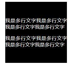
その結果は図のようになります。

VI: フレックスレイアウト (
Added 2018/04/17
)
html コードです。
<div class="flex">
    <div>
       <p>I am multi-line textI am multi-line textI am multi-line textI am multi-line textI am multi-line text</p>
      <p> I am multi-line text I am multi-line text I am multi-line text I am multi-line text I am multi-line text </p>
    </div>
</div>
CSSのコードです。
.flex{
    /*flex layout*/
    display: flex;
    /*centering vertically*/
    align-items: center;
    /*center horizontally*/
    justify-content: center;

    text-align: justify;
    width:200px;
    height:200px;
    background: #000;
    margin:0 auto;
    color:#fff;
}
達成された効果
CSSのこの記事は、このに導入され、より関連するCSSは、コンテンツの垂直センタリングdivは、以前の記事のスクリプトのホームを検索してくださいまたは次の関連記事を閲覧し続け、より多くのスクリプトのホームをサポートすることを願って!ケース要約をセンタリングされます。
関連
最新
-
nginxです。[emerg] 0.0.0.0:80 への bind() に失敗しました (98: アドレスは既に使用中です)
-
htmlページでギリシャ文字を使うには
-
ピュアhtml+cssでの要素読み込み効果
-
純粋なhtml + cssで五輪を実現するサンプルコード
-
ナビゲーションバー・ドロップダウンメニューのHTML+CSSサンプルコード
-
タイピング効果を実現するピュアhtml+css
-
htmlの選択ボックスのプレースホルダー作成に関する質問
-
html css3 伸縮しない 画像表示効果
-
トップナビゲーションバーメニュー作成用HTML+CSS
-
html+css 実装 サイバーパンク風ボタン