HambergurMenu (ハンバーガースタイルのメニュー)のHTML+Sass実装
2022-01-07 12:25:17
数日前に海外の人がHTML+CSSでHamburgerMenuを実装している動画を見て、最近Sassを見ていたので、Sassを使って実装してみました。
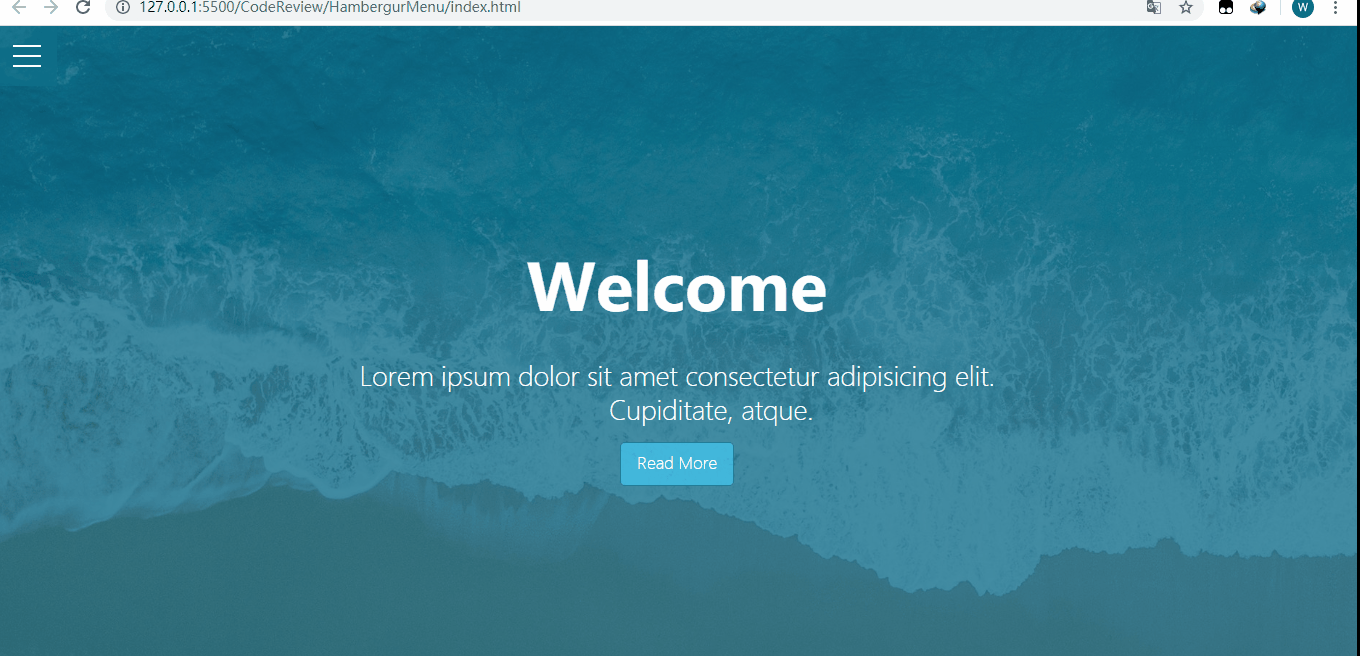
最終的にはこのような感じになりました。
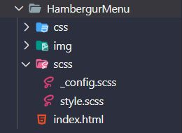
VS Codeでのファイル構造(scssファイルのコンパイルにはeasy sassが使用されます)。
ページ構成(index.html)。
_config.scss。
/* Set color and max-width*/
$primary-color: rgba(13,110,139,.75);
$overlay-color: rgba(24,39,51,.85);
$max-width: 980px;

/* Set the text color to black if the background color is light, otherwise set it to white */
@function set-text-color($color){
  @if(lightness($color)>70){
    @return #333;
  }@else{
    @return #fff;
  }
}

/*mixin to set the background color and text color*/
@mixin set-background($color){
  background-color: $color;
  color: set-text-color($color);
}
style.scssを使用します。
@import '_config';
*{
  margin: 0;
  padding: 0;
}

.container{
  max-width: $max-width;
  margin: 0 auto;
}

/* set the background color for the showcase, add another background image using the pseudo-class, and also set the z-index of the background image to -1 (so that the image will be displayed inside).
Then to get the text to show in the middle, so use flex layout */
.showcase{
  position: relative;
  height: 100vh;
  background-color: $primary-color;
  &:before{
    content: '';
    position: absolute;
    left: 0;
    top: 0;
    width: 100%;
    height: 100%;
    background: url('... /img/pexels-photo-533923.jpeg') no-repeat center center / cover;
    z-index: -1;
  }
  &-inner{
    display: flex;
    height: 100%;
    flex-direction: column;
    justify-content: center;
    align-items: center;
    text-align: center;
    color: #fff;
    font-weight: 100;
    h1{
      font-size: 4rem;
      padding: 1.2rem 0;
    }
    p{
      white-space: pre-wrap;
      font-size: 1.6rem;
      padding: 0.85rem 0;
    }
    .btn{
      padding: .65rem 1rem;
        /* Set the background color and text color using the blender */
      @include set-background(lighten($primary-color,30%));
      border: none;
      border: 1px solid $primary-color;
      border-radius: 5px;
      text-decoration: none;
      outline: none;
      transition: all .2s ease .1s;
        /* Use css3's scale to set a scaling effect when the button hovers*/
      &:hover{
        @include set-background(lighten($overlay-color,30%));
        border-color: lighten($overlay-color, 25%);
        transform: scale(.98);
      }
    }
  }
}

/*Principle: style change by checkbox point or not (set checkbox transparency to 0, z-index to higher), when clicked, menu will appear, click again, menu disappears*/
/* set fixed to menu-wrap so that the showcase will fill the whole screen; also set the checkbox opacity to 0.
Also note that the z-index of the checkbox needs to be set to 2, because the z-index of the hamburger is set to 1, otherwise it will click does not work
*/
.menu-wrap{
  position: fixed;
  left: 0;
  top: 0;
  z-index: 1;
  .toggle{
    position: absolute;
    left: 0;
    top: 0;
    width: 50px;
    height: 50px;
    opacity: 0;
    z-index: 2;
    cursor: pointer;
      /* Set the rotation effect of divs and pseudo-classes inside the hamburger when the checkbox is checked*/
    &:checked ~ .hamburger>div{
      transform: rotate(135deg);
        /* The pseudo class is actually rotated 225 degrees, and the top needs to be set to 0, otherwise the resulting ❌ will not be the same length */
      &:before,&:after{
        transform: rotate(90deg);
        top: 0;
      }
    }

      /* When the checkbox is checked and then hovered, it will also set a rotation effect*/
    &:checked:hover ~ .hamburger>div{
      transform: rotate(235deg);
    }
    &:checked ~ .menu{
      visibility: visible;
      >div{
        transform: scale(1);
        >div{
          opacity: 1;
        }
      }
    }
  }

  .hamburger{
    position: absolute;
    left: 0;
    top: 0;
    width: 60px;
    height: 60px;
    padding: 1rem;
    background-color: $primary-color;
    box-sizing: border-box;
    display: flex;
    flex-direction: column;
    justify-content: center;
    align-items: center;
    text-align: center;
    z-index: 1;
      /* The div itself generates the middle horizontal line, then sets the positioning to relative, followed by setting its pseudo-class to absolute
      offset relative to the div*/
    >div{
      position: relative;
      left: 0;
      top: 0;
      width: 100%;
      height: 2px;
      background-color: #fff;
      transition: all .7s ease;
        /* Generate the first and third horizontal lines using pseudo-classes*/
      &:before,
      &:after{
        content: '';
        position: absolute;
        left: 0;
        top: -10px;
        width: 100%;
        height: 2px;
        background-color: inherit;
      }
      &:after{
        top: 10px;
      }
    }
  }

    /* Set the style of the menu when selected*/
    /* Set menu to fixed, while width and height to 100%, then set display to flex, otherwise the menu will not appear in the middle */
  .menu{
    position: fixed;
    left: 0;
    top: 0;
    width: 100%;
    height: 100%;
    overflow: hidden;
    display: flex;
    justify-content: center;
    align-items: center;
    visibility: hidden; /* set menu to invisible, then visible when checkbox is selected*/
    transition: all .75s ease;
    >div{
      @include set-background($overlay-color);
      width: 200vw;
      height: 200vh;
      overflow: hidden;
      border-radius: 50%;
      display: flex;
      justify-content: center;
      align-items: center;
      text-align: center;
      transform: scale(0);
      transition: all .4s ease;
      >div{
        max-width: 90vw;
        max-height: 90vh;
        opacity: 0;
        transition: all .4s ease;
        >ul>li{
          list-style: none;
          font-size: 2rem;
          padding: .85rem 0;
          text-transform: uppercase;
          transform: skew(-5deg,-5deg) rotate(5deg);/* set text skew*/
          a{
            color: inherit;
            text-decoration: none;
            transition: color .4s ease;
          }
        }
      }
    }
  }
}
関連
最新
-
nginxです。[emerg] 0.0.0.0:80 への bind() に失敗しました (98: アドレスは既に使用中です)
-
htmlページでギリシャ文字を使うには
-
ピュアhtml+cssでの要素読み込み効果
-
純粋なhtml + cssで五輪を実現するサンプルコード
-
ナビゲーションバー・ドロップダウンメニューのHTML+CSSサンプルコード
-
タイピング効果を実現するピュアhtml+css
-
htmlの選択ボックスのプレースホルダー作成に関する質問
-
html css3 伸縮しない 画像表示効果
-
トップナビゲーションバーメニュー作成用HTML+CSS
-
html+css 実装 サイバーパンク風ボタン
おすすめ
-
Textareaの使用上の注意点
-
HTML中国語文字エンコーディング標準紹介
-
テーブル関連の仕上げとJavascriptによるtable,tr,tdの操作について
-
ボタンで送信の種類が指定されておらず、ボタンをクリックしても指定されたURLにジャンプしない
-
セレクトドロップダウンメニューのテキストを左右にスクロールするように設定する方法
-
Baiduの入力メソッドオープンAPIは、使用を移植するために自由であると主張する
-
Web制作マスターのためのよく使われるHTMLタグの解説
-
htmlフレーム、Iframe、Framesetの違いについて
-
htmlカスタムタグの使用方法
-
HTMLのテーブルレイアウトの実用的な使い方を解説