ぼかしによる視覚的な立体感の表現例解説
この短い記事では、視覚的な3D効果を実現するためにぼかしを使用するテクニックについて説明します。
通常の視覚効果では、近づけば近づくほど鮮明に見え、遠ざかれば遠ざかるほど鮮明でなくなることは、皆さんご存知ですよね〜。
クリアな状態とぼやけた状態の両方を使用して、視差効果を構築することができます。このように。

また、CSSでは、ぼかしフィルターで
filter: blur()
と共に
transform-style: preserve-3d
を使用して実装します。
テキストの3次元変換を実装する
まず、テキストの3D変換を実装する必要がありますが、これは比較的簡単です。これは比較的簡単で、主に
transform-style: preserve-3d
と
perspective
で、テキストをY軸を中心に回転させます。
簡単なコードは以下の通りです。
<p>CSS3DEFFECT</p>
body {
    perspective: 160vmin;
}

p {
    font-size: 24vmin;
    transform-style: preserve-3d;
    animation: rotate 10s infinite ease-in-out;
}

@keyframes rotate {
    0% {
        transform: rotateY(-45deg);
    }
    50% {
        transform: rotateY(45deg);
    }
    100% {
        transform: rotateY(-45deg);
    }
}
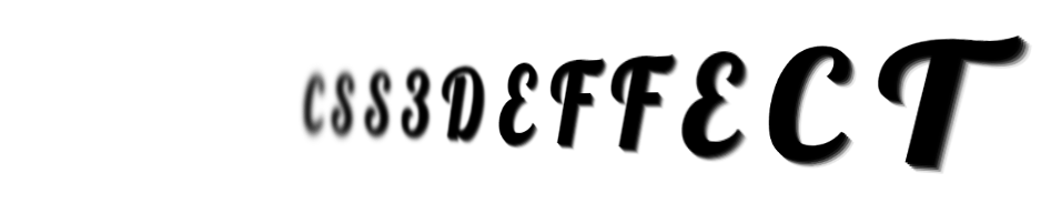
そして、次のような3Dテキスト効果を得ることができます。

文字ぼかしの実装
この効果には、すでに初期に3D効果がありますが、それだけでは何か物足りない感じがします。次に、近くにあるテキストは鮮明に、遠くにあるテキストはぼやけるように、ぼかし効果を追加する必要があります。
しかし、そのためには、それぞれのテキストを細かく調整する必要があり、上記のHTML構造では、それぞれのテキストに対して個別に調整することはできないので、単純に構造を見直すことにしましょう。
<p>
    <span>C</span>
    <span>S</span>
    <span>S</span>
    <span>3</span>
    <span>D</span>
    <span>E</span>
    <span>F</span>
    <span>F</span>
    <span>E</span>
    <span>C</span>
    <span>T</span>
</p>
完全なコードは、おそらく次のようになります。
@import url('https://fonts.googleapis.com/css2?family=Lobster&display=swap');

$count: 12;

body, html {
    font-family: 'Lobster', cursive;
    perspective: 160vmin;
    overflow: hidden;
}

p {
    margin: auto;
    font-size: 24vmin;
    transform-style: preserve-3d;
    animation: rotate 10s infinite ease-in-out;

    span {
        text-shadow:
            1px 1px 0 rgba(0, 0, 0, .9),
            2px 2px 0 rgba(0, 0, 0, .7),
            3px 3px 0 rgba(0, 0, 0, .5),
            4px 4px 0 rgba(0, 0, 0, .3),
            5px 5px 0 rgba(0, 0, 0, .1);

        &:nth-child(-n+5) {
            animation-delay: -5s;
        }
    }
}

@for $i from 1 to 7 {
    span:nth-child(#{$i}),
    span:nth-last-child(#{$i}) {
        animation: filterBlur-#{$i} 10s infinite ease-in-out;
    }

    @keyframes filterBlur-#{$i} {
        0% {
            filter: blur(0px) contrast(5);
        }
        50% {
            filter: blur(#{7 - $i}px) contrast(1);
        }
        100% {
            filter: blur(0px) contrast(5);
        }
    }
}
@keyframes rotate {
    0% {
        transform: rotateY(-45deg);
    }
    50% {
        transform: rotateY(45deg);
    }
    100% {
        transform: rotateY(-45deg);
    }
}
これを簡単に解析すると、必要な効果をよく見るためのヒントがあります。
1. 回転の効果で一番左と一番右ではそれぞれ一番近い文字と一番遠い文字になり、その効果は実は同じであるはずなので、一番と一番下の文字は一律に処理し、二番目と一番下の文字は一律に処理する、ここではSASSの助けを借りて、SASSを使った
:nth-child
と
:nth-last-child
CSSコードの効率的な記述
2. 一度に半分が明確で、半分があいまいで、異なる扱いが必要な、使用する
animation-delay
で半分のアニメーションを遅らせる
3. と組み合わせることができます。
text-shadow
テキストをより立体的にするために
こうすると、最終的に次のような効果が得られます。
完全なコードについては、こちらをご覧ください。 CSS inspiration -- filter:blurでテキストの立体感を強調する。
ブラーを使った落ち葉の効果
ぼかしの正しい使い方は、葉っぱのエフェクトを構築するのに必要な
transform-style: preserve-3d
と
perspective
を追加することで、素敵な3D効果を構築することもできます。
Youtubeのチュートリアル動画で見た以下のような葉っぱの効果は、ぼかしと単純な階層を使うことで全体をとてもリアルに見せています。
<h2>Falling Leaves</h2>
<section>
  <div class="leaf">
    <div><img src="fallen-leaves-image.png" /></div>
    <div><img src="Falling Leaves Image.png" /></div>
    <div><img src="Falling Leaves Image.png" /></div>
    <div><img src="Falling Leaves Image.png" /></div>
    <div><img src="Falling Leaves Image.png" /></div>
    <div><img src="Falling Leaves Image.png" /></div>
    <div><img src="Falling Leaves Image.png" /></div>
  </div>
  <div class="leaf leaf2">
    // Repeat for the second group
  </div>
  <div class="leaf leaf3">
    // repeat the third group
  </div>
</section>
.leaf {
  position: absolute;
  width: 100%;
  height: 100%;
  top: 0;
  left: 0;
}
.leaf img {
  width: 75px;
  height: 75px;
}
.leaf div:nth-child(1) {
  left: 20%;
  animation: fall 22s linear infinite;
  animation-delay: -2s;
}
.leaf div:nth-child(2) {
  left: 70%;
  animation: fall 18s linear infinite;
  animation-delay: -4s;
}
.leaf div:nth-child(3) {
  left: 10%;
  animation: fall 21s linear infinite;
  animation-delay: -7s;
}
.leaf div:nth-child(4) {
  left: 50%;
  animation: fall 24s linear infinite;
  animation-delay: -5s;
}
.leaf div:nth-child(5) {
  left: 85%;
  animation: fall 19s linear infinite;
  animation-delay: -5s;
}
.leaf div:nth-child(6) {
  left: 15%;
  animation: fall 23s linear infinite;
  animation-delay: -10s;
}
.leaf div:nth-child(7) {
  left: 90%;
  animation: fall 20s linear infinite;
  animation-delay: -4s;
}
.leaf2 {
  transform: scale(1.6) translate(5%, -5%) rotate(15deg);
  filter: blur(1px);
  z-index: 10;
}
.leaf3 {
  filter: blur(2px);
  transform: scale(0.8) translate(-5%, 10%) rotate(170deg);
}
@keyframes fall {
  0% {
    top: -30%;
    transform: translateX(20px) rotate(0deg);
  }
  20% {
    transform: translateX(-20px) rotate(45deg);
  }
  40% {
    transform: translateX(20px) rotate(90deg);
  }
  60% {
    transform: translateX(-20px) rotate(135deg);
  }
  80% {
    transform: translateX(20px) rotate(180deg);
  }
  100% {
    top: 150%;
    transform: translateX(-20px) rotate(225deg);
  }
}

クリアとブレの2つの状態をスピードの違いで対比させることで、パララックス効果を構築するのが主なポイントです。
上記は、視覚的な3D効果の例を達成するためにぼかしの使用の詳細な説明であり、視覚的な3Dを達成するためにぼかしについての詳細は、スクリプトの家の他の関連記事に注意を払うして下さい
関連
最新
-
nginxです。[emerg] 0.0.0.0:80 への bind() に失敗しました (98: アドレスは既に使用中です)
-
htmlページでギリシャ文字を使うには
-
ピュアhtml+cssでの要素読み込み効果
-
純粋なhtml + cssで五輪を実現するサンプルコード
-
ナビゲーションバー・ドロップダウンメニューのHTML+CSSサンプルコード
-
タイピング効果を実現するピュアhtml+css
-
htmlの選択ボックスのプレースホルダー作成に関する質問
-
html css3 伸縮しない 画像表示効果
-
トップナビゲーションバーメニュー作成用HTML+CSS
-
html+css 実装 サイバーパンク風ボタン