[解決済み] Python matplotlib 複数本の棒グラフ
2022-07-02 08:57:54
質問
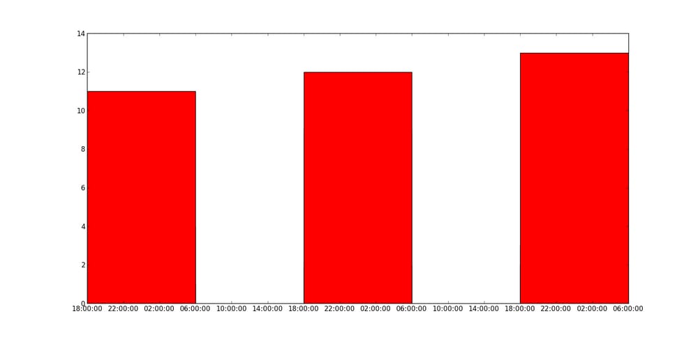
matplotlibで複数の棒グラフを描画する方法ですが、bar関数を複数回呼び出すと重なってしまい、下の図のように最高値の赤だけが表示されてしまいます。 X軸に日付のある複数のバーをプロットするにはどうしたらよいでしょうか?
今のところ、こんな感じでやってみました。
import matplotlib.pyplot as plt
import datetime

x = [
    datetime.datetime(2011, 1, 4, 0, 0),
    datetime.datetime(2011, 1, 5, 0, 0),
    datetime.datetime(2011, 1, 6, 0, 0)
]
y = [4, 9, 2]
z = [1, 2, 3]
k = [11, 12, 13]

ax = plt.subplot(111)
ax.bar(x, y, width=0.5, color='b', align='center')
ax.bar(x, z, width=0.5, color='g', align='center')
ax.bar(x, k, width=0.5, color='r', align='center')
ax.xaxis_date()

plt.show()
こうなりました。
結果は以下のようになりますが、日付がX軸にあり、棒グラフは隣り合っています。
どのように解決するのですか?
import matplotlib.pyplot as plt
from matplotlib.dates import date2num
import datetime

x = [
    datetime.datetime(2011, 1, 4, 0, 0),
    datetime.datetime(2011, 1, 5, 0, 0),
    datetime.datetime(2011, 1, 6, 0, 0)
]
x = date2num(x)

y = [4, 9, 2]
z = [1, 2, 3]
k = [11, 12, 13]

ax = plt.subplot(111)
ax.bar(x-0.2, y, width=0.2, color='b', align='center')
ax.bar(x, z, width=0.2, color='g', align='center')
ax.bar(x+0.2, k, width=0.2, color='r', align='center')
ax.xaxis_date()

plt.show()
<イグ
"yの値も重なる"の意味が分かりませんが、以下のコードで解決しますか?
ax = plt.subplot(111)
w = 0.3
ax.bar(x-w, y, width=w, color='b', align='center')
ax.bar(x, z, width=w, color='g', align='center')
ax.bar(x+w, k, width=w, color='r', align='center')
ax.xaxis_date()
ax.autoscale(tight=True)

plt.show()
<イグ
関連
-
Pythonの非常に便利な2つのデコレーターを解説
-
Python 入出力と高次代入の基礎知識
-
[解決済み] Pythonには文字列の'contains'サブストリングメソッドがありますか?
-
[解決済み] Pythonで現在時刻を取得する方法
-
[解決済み] 複数の例外を1行でキャッチする(ブロックを除く)
-
[解決済み] Pythonで2つのリストを連結する方法は?
-
[解決済み] Pythonで例外を手動で発生(スロー)させる
-
[解決済み] Matplotlibでプロットを表示するのではなく、画像ファイルに保存する。
-
[解決済み】ネストされたディレクトリを安全に作成するには?
-
[解決済み】Pythonに三項条件演算子はありますか?
最新
-
nginxです。[emerg] 0.0.0.0:80 への bind() に失敗しました (98: アドレスは既に使用中です)
-
htmlページでギリシャ文字を使うには
-
ピュアhtml+cssでの要素読み込み効果
-
純粋なhtml + cssで五輪を実現するサンプルコード
-
ナビゲーションバー・ドロップダウンメニューのHTML+CSSサンプルコード
-
タイピング効果を実現するピュアhtml+css
-
htmlの選択ボックスのプレースホルダー作成に関する質問
-
html css3 伸縮しない 画像表示効果
-
トップナビゲーションバーメニュー作成用HTML+CSS
-
html+css 実装 サイバーパンク風ボタン
おすすめ
-
Python関数の高度な応用を解説
-
Python 人工知能 人間学習 描画 機械学習モデル作成
-
PythonはWordの読み書きの変更操作を実装している
-
python implement mysql add delete check change サンプルコード
-
Python入門 openを使ったファイルの読み書きの方法
-
Pythonの@decoratorsについてまとめてみました。
-
[解決済み】Pythonスクリプトで「Expected 2D array, got 1D array instead: 」というエラーが発生?
-
[解決済み】socket.error: [Errno 48] アドレスはすでに使用中です。
-
[解決済み】TypeError: re.findall()でバイトのようなオブジェクトに文字列パターンを使用することはできません。)
-
[解決済み] 'int'オブジェクトに'__getitem__'属性がない。