[css3]CSS3+HTML5+JSでブロックの縮小・拡大アニメーション効果を実装する。
最近、あるプロジェクトを進めていて、CSS3のアニメーション技術をほとんど使っていないことに気がつきました。 表示 その なし と ブロック または 視認性 の 隠された と 可視 を使って制御します。そこで、最近のプロジェクトでは、アニメーションに関するCSS3のテクニックを掘り下げて応用するようになり、リストブロックの収縮 & 展開のアニメーションをご紹介しています。
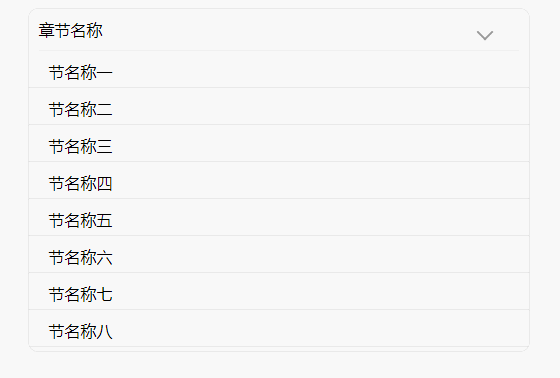
簡単なレンダリング
実装のアイデア
大雑把に言うと、リストブロックを ヘッダーブロック と コンテンツブロック
(1) タイトルブロック タイトルとアイコンをshrink&expandのアニメーション効果で表示する
(1) アイコンの部分は、擬似クラスを使って矢印を描き、その上に トランスフォーム の回転プロパティは 回転 アイコンの向きとアニメーションを制御する .
アニメーション制御、通常はタイトル部をクリックするとリストが縮小&拡大するので、タイトル部をクリックした時のクラスを制御する。
(2)コンテンツブロック。 コンテンツブロックはコンテンツを表示し、ブロックは主なアニメーション効果であるリストの収縮 & 展開をホストします。
(1) アニメーション効果。このブロックのアニメーションは、ブロック全体の高さが閉じられ、中のコンテンツが左に隠れるというもので、高さとアニメーションの隠れを制御する必要があるので マックスハイト 高さ制御のために transition(アニメーション時間設定)、transformのプロパティ トランスレート をクリックすると、コンテンツが非表示になります。
コードの全文は以下の通りです。
<!DOCTYPE html>
   <html>
   <head>
       <title></title>
       <style type="text/css">
           .block_wrap {
               width: 500px;
               margin: 0 auto;
               border: 1px solid #e3e3e3;
              border-radius: 10px;
          }
          .chapter_wrap {
              background: white;
             text-align: left;
             border-radius: 8px;
            color: #333333;
            margin-bottom: 15px;
             font-size: 14px;
           overflow: hidden;
       }
       .title_item_wrap {
             padding: 10px 10px 10px 0;
           margin: 0 10px 0 10px;
           border-bottom: none;
            display: flex;
             align-items: center;
        }
         /* icon drawing using pseudo-classes*/
         .title_item_wrap::after {
            content: '';
            width: 10px;
             height: 10px;
             border-top: 2px solid #999999;
             border-right: 2px solid #999999;
            transform: rotate(-45deg);
            display: inline-block;
           transition: 0.3s;
            float: right;
            margin-top: 10px;
       }
        /* Use the acitve class to control the rotation of the icon and the lower border of the title when expanded*/
        .active {
             border-bottom: 1px solid #F0F0F0;
        }
        .active::after {
            transform: rotate(135deg);
            margin-top: 5px;
         }
        .chapter_title {
             font-size: 16px;
             padding: 0;
            margin: 0;
             width: calc(100% - 30px);
        }
         .node_wrap {
             overflow: hidden;
             overflow-y: scroll;
             transition: 0.3s;
         }
         .node_wrap p {
           padding: 0 20px 5px 20px;
            margin: 10px 0;
            border-bottom: 1px solid #e3e3e3
        }
        /* Hide the slider for the content block */
        .node_wrap::-webkit-scrollbar {
            display: none;
        }
        /* control content block hide When hidden, the whole block is panned 200% to the left and the maximum height is set to 0, otherwise the page will be left blank */
        .node_wrap_hide {
             transform: translate(-200%, 0);
             max-height: 0;
        }
        /* control the display of the content block, when displayed, the whole block is restored to the right, and the maximum height is set to 300px, the content inside the block will be propped up */
        .node_wrap_show {
            transform: translate(0, 0);
          max-height: 300px;
       }
    </style>
 </head>
 <body>
    <div class="block_wrap">
        <div id="block_wrap" class="title_item_wrap active">
            <p class="chapter_title">chapter_name</p>
        </div>
        <div id="list_wrap" class="node_wrap node_wrap_show">
             <p>section name one</p>
            <p>Section name II</p>
           <p>Section name III</p>
           <p>Section name IV</p>
             <p>Section name V</p>
            <p>Section name VI</p>
            <p>Section name VII</p>
             <p>Section name VIII</p>
             <p>Section name IX</p>
            <p>Section name X</p>
       </div>
     </div>
 </body>
 <script type="text/javascript">
     // Get the header element
   var block_wrap = document.getElementById('block_wrap')

    // Add a click event to the title element to control the addition & removal of the class by clicking to achieve the animation effect
     block_wrap.onclick = function() {
        // get the title element className collection
        let classArray = this.className.split(/\s+/)

        // Get the content block elements
        let list_wrap = document.getElementById('list_wrap')

        // determine whether the title element has class active, if it exists, then the list is expanded, then click it to hide the content block, otherwise show the content block
         if (classArray.includes('active')) {
            // Hide the content block
            block_wrap.classList.remove('active')
             list_wrap.classList.remove('node_wrap_show')
           list_wrap.classList.add('node_wrap_hide')
             console.log(this.className.split(/\s+/))
             return
        } else {
           // Display the content block
            block_wrap.classList.add('active')
            list_wrap.classList.add('node_wrap_show')
            list_wrap.classList.remove('node_wrap_hide')
            return
         }
     }
 </script>
 </html>
上記のコードは、HTMLファイルに直接コピーして保存すると、効果を確認することができます。このアニメーション効果はモバイルに適応しており、PCでは少し欠点が出ますが、少しの加工で対応可能です。
CSS3+HTML5+JSで収縮と膨張のブロックのアニメーション効果を達成することについて、この記事を紹介し、より関連するHTML5伸縮アニメーションコンテンツは、スクリプトハウスの過去の記事を検索するか、次の関連記事を閲覧を続けてください、私はあなたが将来的にもっとスクリプトハウスをサポートして願っています!.
関連
-
[CSSチュートリアル】CSSのトリッキーなグラデーションで高度な背景光アニメーションの感覚を実現
-
[CSSチュートリアル】 css border add four corners コード
-
[CSSチュートリアル】CSSのクラスとidの共通命名規則
-
[CSSチュートリアル】CSSでemを開く正しい方法 詳細へ
-
[CSSチュートリアル】CSSプロパティ*-gradientの有用性を探る
-
[ブラウザ互換性チュートリアル]IE9でのネイティブページの互換性問題の解決方法について
-
[css3]css3によるフレックスレイアウト幅の解決方法が有効でない件
-
[CSSチュートリアル】背景画像画面の適応的な実装を実現するCSS
-
[css3]CSS3遷移回転遠近法2D3Dアニメーションなどの効果を持つサンプルコード
-
[css3]CSS3は本当にSCSSに取って代わるのだろうか?
最新
-
nginxです。[emerg] 0.0.0.0:80 への bind() に失敗しました (98: アドレスは既に使用中です)
-
htmlページでギリシャ文字を使うには
-
ピュアhtml+cssでの要素読み込み効果
-
純粋なhtml + cssで五輪を実現するサンプルコード
-
ナビゲーションバー・ドロップダウンメニューのHTML+CSSサンプルコード
-
タイピング効果を実現するピュアhtml+css
-
htmlの選択ボックスのプレースホルダー作成に関する質問
-
html css3 伸縮しない 画像表示効果
-
トップナビゲーションバーメニュー作成用HTML+CSS
-
html+css 実装 サイバーパンク風ボタン
おすすめ
-
[CSSチュートリアル】CSSアニメーション 途中で止める方法とポーズを維持する方法
-
[CSSチュートリアル】CSS3Animationで実現する簡単な指のクリックアニメーションの例
-
[CSS3] CSS3リスト無限スクロール/回転効果
-
[CSSチュートリアル】パララックススクロールの効果を完成させるCSS
-
[CSSチュートリアル】CSSの新機能には、ページの再描画や並び替えの問題をコントロールする機能が含まれています。
-
[CSSチュートリアル】ネイティブCSSでテキストの無制限回転を実現する汎用的な方法
-
[CSSチュートリアル】カラフルで知的なシャドウ効果を実現するCSS
-
[CSSチュートリアル]css use negative margin to achieve average layout of example.
-
[CSSチュートリアル】CSSスタイルをプログラムで処理するサンプルコード
-
[CSSチュートリアル】display:olck/noneでメニューバーを完成させる方法