html5でBUI折りたたみメニュープラグインを書く方法
2022-01-29 05:10:47
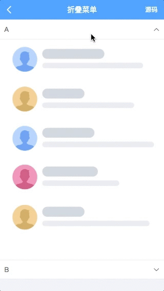
BUI折りたたみメニューの書き方 プラグイン効果プレビュー
制御分析 制御構造
クリックで表示と非表示の効果があり、クリックするとまず拡張を隠し、次に自身を拡張します。その構造をインターフェースから見てみましょう。
<! -- The outermost layer of a control is generally the name of the control's container -->
<div class="bui-foldmenu">
    <div class="bui-foldmenu-item">menu</div>
    <div class="bui-foldmenu-content">content</div>
    <div class="bui-foldmenu-item">Menu2</div>
    <div class="bui-foldmenu-content">content2</div>
</div>
ここでは横並びの階層を使っているので、ちょっと書きにくいですが、dl,dt,ddと同じ構造なので、以下のように最適化することができます。
<! -- The outermost layer of a control is generally the name of the control's container -->
<dl class="bui-foldmenu">
    <dt>menu</dt>
    <dd>content</dd>
    <dt>Menu2</dt>
    <dd>content2</dd>
</dl>
ブイのデザインは、ボタンプロトタイプのコンテナの支え方によって、各コンテナの高さが同じ基準に保たれるので、その後、構造を最適化します。
<! -- The outermost layer of a control is generally the name of the control's container -->
<dl class="bui-foldmenu">
    <dt class="bui-btn">menu</dt>
    <dd>content</dd>
    <dt class="bui-btn">menu2</dt>
    <dd>content2</dd>
</dl>
上の画像のように、メニューがクリックされ、アイコンがトグルし、レイアウトと組み合わされて以下のような構造になり、すべてがレイアウト、すべてがコンテナになります。
<! -- The outermost layer of a control is generally the name of the control's container -->
<dl class="bui-foldmenu">
    <dt class="bui-btn bui-box"><div class="span1">menu</div><i class="icon-foldmenu"> </i></dt>
    <dd>content</dd>
    <dt class="bui-btn bui-box"><div class="span1">menu2</div><i class="icon-foldmenu"> ;</i></dt>
    <dd>content2</dd>
</dl>
制御スタイル
通常、プラグイン用のスタンドアロンスタイルとして導入されます。
bui-foldmenu.css
ファイル
.bui-foldmenu {}

.bui-foldmenu>dt,
.bui-foldmenu>[class*=bui-btn] {
    border: 0;
    border-bottom: 1px solid #eee;
}
/* Hide content by default */
.bui-foldmenu>dd {
    display: none;
    border: 0;
    overflow-y: auto;
    border-bottom: 1px solid #eee;
    background: #fff;
}
/* Icons */
.bui-foldmenu .icon-foldmenu {
    -webkit-transition: -webkit-transform 0.3s ease-in-out 0s;
    transition: transform 0.3s ease-in-out 0s;
}
.bui-foldmenu .icon-foldmenu:before {
    content: "\e649";
}
/* Show block when activated */
.bui-foldmenu>.active+dd {
    display: block;
}
/* Flip the arrow when the secondary menu is active */
.bui-foldmenu>.active .icon-foldmenu {
    -webkit-transform: rotate(-180deg);
    transform: rotate(-180deg);
}
デフォルトのスタイルは、コントロールによって初期化されたコンテンツタグ(ddに隣接するdt)、その他のすべての修正、およびアクティブな状態を設定するときに矢印を反転させることを非表示にすることです。
コントロールスクリプト
1.5.4 bui.extendメソッドを追加。プラグインを拡張しても、元のbuiの使い方と同じになる。
bui.extend 制御パラメータは、以下のパラメータを含むオブジェクトです。
名前
string
制御名設定
object
コントロールデフォルトパラメータコールバック
function
コントロールのロジックの最も単純なバージョン
// The simplest version of
bui.extend({
    name: "foldmenu",
    config: {
        id: ""
    },
    callback: function(opt) {

        // that points to the plugin's thrown public methods, option widget, etc.
        let that = this;
        // this.config is the result of merging with the initialization parameters;
        let param = this.config;
        // cache the selector
        let $id = null;

        // Method to throw to the developer
        that.init = function(option) {
            // Merge the parameters for direct calls to the init method
            param = $.extend(true, {}, param, option);

            // Single-page multi-page selector, if it is single page, this plugin can only be used in the module, not in bui.ready
            $id = bui.$(param.id);

                // Bind events to add activation style when clicked
            $id.children("dt").click(function(e) {
                var hasActive = $(this).hasClass("active");
                if (hasActive) {
                    $(this).removeClass("active");
                } else {
                    // Adding the style will automatically handle the arrows and the next level of display;
                    $(this).addClass("active");
                }
            })

            return that;
        }

        // If you have a dependency on the bui control, you should write it here, so that it is easy to call externally
        // that.widgets.loading = ui.loading({
        // appendTo: opt.id
        // });

        // If you need to destroy the lifecycle, add it here.
        // that.beforeDestroy = function() {
        //
        // return that;
        // }

        // The id must be passed
        if (!param.id) {
            // Throw an error
            bui.showLog("Must pass id parameter. ")
            return that;
        }
        // initialize once by default
        return this.init(opt);
    }
});
このコントロールでは
<dl id="folder" class="bui-foldmenu">
    <dt class="bui-btn">menu</dt>
    <dd>content</dd>
    <dt class="bui-btn">menu2</dt>
    <dd>content2</dd>
</dl>
  // Initialize
  var uiFloder = bui.foldmenu({id:"#folder"})

  // uiFloder.config can get some of the instance's parameters
プラグインプレビュー
プラグインのリファイン
クロージングで地球環境汚染を防止
がクロージャの中に置かれることで、コントロールが汚染されるのを防ぐことができます。window.libsを参照しています。zeptoまたはjqueryを削除した場合、zepto.jsの導入が必要です。jquery.jsと表示され、jqueryのバージョンに完全に切り替えることができます。(jqueryの推奨バージョン:1.9.x~1.11.x)
;(function(ui, $) {
    "use strict";


})(window.bui || {}, window.libs);
コメントの追加
/* @namespace bui
  * @class foldmenu
  * @constructor
  * @param {object} option
  * @param {string} option.id [control id]
  * @param {string} [option.handle] [area to click on]
  * @param {number} [option.height] [parent height, 0 is adaptive]
  * @param {string} [option.target] [The target to show hidden] * @param {string} [option.target] [The target to show hidden]
  * @param {number} [option.targetHeight] [target adaptive height or limit height]
  * @param {boolean} [option.single] [ false(show multiple) || true(collapse one at a time) ]
  * @param {function} [option.onInited] [ 1.5.1 new Triggered after initialization ]
  * @param {function} [option.callback] [ callback for button click ]
  * @example
  *
  */
フルバージョン
;(function(ui, $) {
    "use strict";
    /* @namespace bui
      * @class foldmenu
      * @constructor
      * @param {object} option
      * @param {string} option.id [control id]
      * @param {string} [option.handle] [area to click on]
      * @param {number} [option.height] [parent height, 0 is adaptive]
      * @param {string} [option.target] [The target to show hidden] * @param {string} [option.target] [The target to show hidden]
      * @param {number} [option.targetHeight] [target adaptive height or limit height]
      * @param {boolean} [option.single] [ false(show multiple) || true(collapse one at a time) ]
      * @param {function} [option.onInited] [ 1.5.1 new Triggered after initialization ]
      * @param {function} [option.callback] [ callback for button click ]
      * @example
      *
      */
      ui.extend({
          name: "foldmenu",
          config: {
              id: ""
          },
          callback: function(opt) {

              // that points to the plugin's thrown public methods, option widget, etc.
              let that = this;
              // this.config is the result of merging with the initialization parameters;
              let param = this.config;
              // cache the selector
              let $id = null;

              // Method to throw to the developer
              that.init = function(option) {
                  // Merge the parameters for direct calls to the init method
                  param = $.extend(true, {}, param, option);

                  // Single page multi-page selector, if it is a single page, this plugin can only be used in the module, not in bui.ready
                  $id = ui.$(param.id);

                      // Bind events to add activation style when clicked
                  $id.children("dt").click(function(e) {
                      var hasActive = $(this).hasClass("active");
                      if (hasActive) {
                          $(this).removeClass("active");
                      } else {
                          // Adding the style will automatically handle the arrows and the next level of display;
                          $(this).addClass("active");
                      }
                  })

                  return that;
              }

              // If you have a dependency on the bui control, you should write it here, so that it is easy to call externally
              // that.widgets.loading = ui.loading({
              // appendTo: opt.id
              // });

              // If you need to destroy the lifecycle, add it here.
              // that.beforeDestroy = function() {
              //
              // return that;
              // }

              // The id must be passed
              if (!param.id) {
                  // Throw an error
                  ui.showLog("Must pass id parameter. ")
                  return that;
              }
              // initialize once by default
              return this.init(opt);
          }
      });

})(window.bui || {}, window.libs);
結論
上記の例では、最もシンプルなプラグインを開発・使用していますが、プラグインの適応性が十分ではなく、様々な拡張や、高さを固定する必要があるコンテンツ、他のセレクタに置き換える必要がある、1つだけ表示する、などの複雑なシナリオを考慮する必要があり、ニーズに応えられないのが実情です。
以上が今回の内容の全てです、勉強になれば幸いです、そしてスクリプトハウスを応援して頂ければ幸いです。
関連
最新
-
nginxです。[emerg] 0.0.0.0:80 への bind() に失敗しました (98: アドレスは既に使用中です)
-
htmlページでギリシャ文字を使うには
-
ピュアhtml+cssでの要素読み込み効果
-
純粋なhtml + cssで五輪を実現するサンプルコード
-
ナビゲーションバー・ドロップダウンメニューのHTML+CSSサンプルコード
-
タイピング効果を実現するピュアhtml+css
-
htmlの選択ボックスのプレースホルダー作成に関する質問
-
html css3 伸縮しない 画像表示効果
-
トップナビゲーションバーメニュー作成用HTML+CSS
-
html+css 実装 サイバーパンク風ボタン
おすすめ
-
html5 pushstateとブラウザリターンイベントのリスニング
-
html5 地図の現在位置の矢印の作り方の例
-
複数の画像を編集するためのキャンバス画像エディタの実装方法
-
キャンバス経由でのRGBAフォーマットへの色変換とパフォーマンス問題の解決
-
HTML5でWeb Notificationのデスクトップ通知を実装する方法
-
N種類のキャンバスエクスポートイメージのクロスドメインポーズサマリーのロックを解除する
-
画像リソースが同一ドメイン下にないために、キャンバスがクロスドメインで汚染される場合の解決策
-
ウェブアプリのページスクロールラグの解決策を詳しく解説
-
キャンバスで画像を圧縮し、カードを作成する例
-
Html5キャンバスパーティクルクロック サンプルコード