テーブルの適応とオーバーフローの設定詳細
1. テーブルリセットの2つの属性
1border-collapse: collapse; /* テーブルのマージボーダーモデルを設定します */
border-spacing: 0; /* 表に現れるセル間の間隔を0にする */。
コード
<div class="fz">
    <div style="width: 600px;" class="bg-grey p10">
        <table class="bg-white">
            <tr>
                <th>serial</th>
                <th> start time</th>
                <th>End time</th>
                <th>Remarks</th>
                <th>Operation</th>
            </tr>
            <tr>
                <td>1</td>
                <td>2014/8/2</td>
                <td>2015/1/1</td>
                <td>Where did the time go</td>
                <td><a href="#">edit</a></td>
            </tr>
        </table>
    </div>
</div>
td,th{padding:0}のみリセットし、borderを設定しない場合の効果

td{ border:1px solid #ff4136;} の設定の効果。
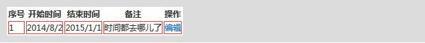
table { border-collapse: collapse; border-spacing.の効果を設定します。0; }

2. 1行のオーバーフロードット表示
.ell { text-overflow: ellipsis; white-space: nowrap; overflow: hidden; }
いくつかのレクイエムがあります。
①要素の幅を必ず設定する。
nowrapテキストは改行されず、<br>タグにぶつかるまで同じ行になります。(テキストが突出するのを防ぎます。高さを定義しても省略記号は表示されず、余分なテキストは切り取られます)。
③overflow: hidden; (テキストが水平方向にはみ出るのを防ぎます。)
④text-overflow: ellipsis; ellipsis オブジェクト内のテキストがオーバーフローした場合、省略したマーカーを表示します(...)。
3、テーブルの幅の設定
td{ border:1px solid #ff4136;}
.title{ width: 100px;}
.kaiyao{ width: 200px;}
.time{ width: 120px;}
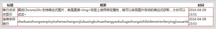
<div class="fz">
<div style="width: 800px;" class="bg-grey p10">
<table class="bg-white pctW">
<tr>
<th class="title">title</th>
<th class="kaiyao">summary</th>
<th class="time">time</th>
</tr>
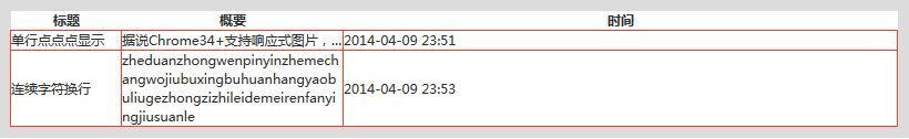
<tr>
<td>Single line dot dot dot display</td>
<td> It is said that Chrome 34+ supports responsive images, that is, directly <img> tag on the use of specific attributes, you can achieve automatic responsive image acquisition, the big guys can try ~</td>
<td>2014-04-09 23:51</td>
</tr>
<tr>
<td>Continuous character line feed</td>
<td>zheduanzhongwenpinyinzhemechangwojiubuxingbuhuanhangyaobuliugezhongzizhileidemeirenfanyingjiusuanle</td>
<td>2014-04-09 23:53</td>
</tr>
</table>
</div>
</div>
ランニングの効果
問題:tdに幅を設定しているが、セルが可動するためテキストにはみ出しの影響がない。また、テーブルの幅は、セルの内容量に応じて自動的にサイズ調整される。
回避策 を追加する。
table{ table-layout: fixed;}
効果
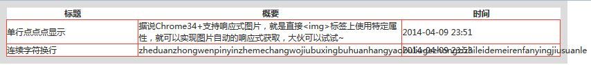
table-layout: fixed
は、テーブルのレイアウトを固定にするために使用します。
問題:中国語はオーバーフローしない、英語はオーバーフローする?テーブルに設定した幅がまだ効かない?
解決方法 要約の2つのセルに.ellと.bkのスタイルを追加します。
.cell_bk { display: table; width: 100%; table-layout: fixed; word-wrap: break-word; }
.bk { word-wrap: break-word; }
ランニングの効果
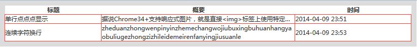
問題:テーブルに設定した幅がまだ効かない?tdごとに幅を設定した場合、実際のセルの幅はテーブルの幅に比例することを計算した。
例えば、テーブルの幅が800pxの場合。tdの幅は100px 200px 100px.で、table-layout:fixedの場合です。これは、1:2:1の比率で800
実際のtdの幅は 200px, 400px, 200pxです。拡大縮小しない場合は、以下のように解決できます。
解決方法 テーブルの最後のセル、"time"参照クラス ".time"の幅制限を解除することです。
効果
タイトルと要約の幅は、それぞれ100pxと200pxに設定されています。
概要を説明します。
(1) テーブルの幅を設定するには、table-layout: fixed というプロパティを追加する必要があります。このプロパティがないと、セルの幅を設定しても .ell と .bk は機能しません。
(2) table-layout: fixedプロパティを追加すると、①セルの幅がパーセンテージで表示されるようになります。(2) table-layout: fixed 属性を追加すると、①セルの幅がパーセンテージで表示される。(2)セルの幅を px で表現する場合、最後のセルは設定されない。
4. 英字連続改行の2段組アダプティブセル部分
/* two-column adaptive cell section with consecutive line breaks*/
.cell_bk { display: table; width: 100%; table-layout: fixed; word-wrap: break-word; }
通常のフロートとは異なり、ラップしていることに注意してください、これはダブルカラムです。
コードです。
.cell{ display: table-cell; *display: inline-block;}
<div class="fz">
    <div style="width: 600px;" class="bg-grey p10">
        <div>
            <img src=" images/xxx.jpg" class="l p10" width="100">
            <div class="cell">
                <p class="cell_bk">
                    On this day in 1977, Luciano Re Cecconi, a 28-year-old Lazio midfielder, walked into a jewelry store in Rome with two friends. For some reason, he suddenly wanted to play a prank joke. Upon entering the jewelry store he shouted, "Freeze! Robbery! " His next and last two words were said after the jewelry store owner rushed out and shot him, "It's a joke!
                    <br/><br/>
                    <span>//zxx:Ixxxxxxxxxxxxxxxxxxxxxxxxxxxxxxxxxxxxxxxxxxxxxxxxxxxxxxxxxxxxxxxxxxxxxxxxxxxxxxxxxxxxxxxxxxxxxxxxxxxxxxxxxxxxxxxxxxxxxxxxxxxxxxxxxxxxxxxxx</span>
                    <h3>No treatment</h3>
                </p>
            </div>
        </div>
    </div>
</div>
効果 (全ブラウザ対応)
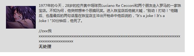
画像imgの幅を200にしたときの効果
注:2カラムの効果のみ、ie6/7ブラウザは3カラムの場合に問題があります。
floatで2カラム効果は可能ですが、画像の幅が変わると適応されないので、右のdivのpadding-leftの値も同時に変更する必要があります。
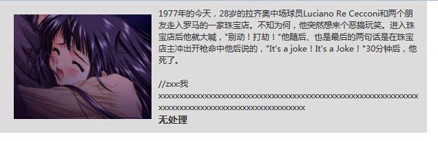
<img src=" images/xxx.jpg" class="l p10" width="200">
      <div style="padding-left: 220px;">
              <p class="cell_bk">
今回の記事は、Table adaptiveとoverflowの設定についてです。Table adaptive and overflowに関する詳しい情報は、Script Houseの過去記事を検索するか、以下の関連記事を引き続き閲覧してください。
関連
-
HTMLの基本タグと構造について解説
-
html フォームコントロールの disabled プロパティ readonly と disabled の比較
-
HTMLの異空間の特徴と表現を探る(推奨)
-
vertical-alignで入力とimgを揃える。
-
テーブルの幅がテキストによって変化しないように設定し、固定幅にする
-
htmlのselect optgroupタグの使い方の紹介
-
htmlと埋め込みFlashの両方にスクロールバーがある場合の解析と対処法
-
XHTMLにおけるtitleタグとparagraphタグの使い方を説明する。
-
TinyEditorは、シンプルで使いやすいhtml WYSIWYGエディタです。
-
IE8 で IE7 のスタイルを使用するように設定するコード
最新
-
nginxです。[emerg] 0.0.0.0:80 への bind() に失敗しました (98: アドレスは既に使用中です)
-
htmlページでギリシャ文字を使うには
-
ピュアhtml+cssでの要素読み込み効果
-
純粋なhtml + cssで五輪を実現するサンプルコード
-
ナビゲーションバー・ドロップダウンメニューのHTML+CSSサンプルコード
-
タイピング効果を実現するピュアhtml+css
-
htmlの選択ボックスのプレースホルダー作成に関する質問
-
html css3 伸縮しない 画像表示効果
-
トップナビゲーションバーメニュー作成用HTML+CSS
-
html+css 実装 サイバーパンク風ボタン
おすすめ
-
HTMLファイルに外部CSSファイルを導入する際のパスのまとめ
-
詳細 HTMLフォントはline-heightを使用して、まだ垂直方向の中央に配置することができません解決策
-
HTMLページのスクロールは、コンテンツの位置の一部が固定されていない場合の実装
-
入力が遅い、ラグがある場合のクイックソリューション[type=file]オープニング
-
htmlページにおけるmeta viewport属性の説明
-
HTML埋め込みタグの使い方と属性の説明
-
IE8、IE9の互換表示モードをHTMLでそれぞれ無効にする裏技
-
選択項目にスタイルを追加するための純粋なcss(スクリプトなし)
-
フレームセットの高さを設定します。インターフェースの変形を解決する
-
初歩的な理解のためのWebページのhtnlの基礎知識