[解決済み】Bootstrapを使用したフォームのマークエラーについて
質問
GWTに頼らずに素敵なページデザインを実現するためにBootstrapを使い始めました(バックエンドはjavaで作られています)
ログイン画面は、これをコピーしました。 例 . 今、私は、例えば、ユーザー名が空白のままであったというエラーをマークしたいのです。そこで、Bootstrapフレームワークでこのための手順は何なのかと思っていました。あるいは、エラー付きのフォームを表示する例があれば教えてください。
エラーメッセージをinput要素の中に赤い色で表示するのか、input要素の下に表示するのか、あるいはポップアップで表示するのか、よくわからないのですが。
どのように解決するのですか?
(Bootstrap v4、v3、v3用のサンプルでUPDATED)
Bootstrapの過去数回のメジャーバージョンに対応したバリデーションクラス付きフォームの例です。
ブートストラップv4
をご覧ください。 ライブバージョン codepenに掲載
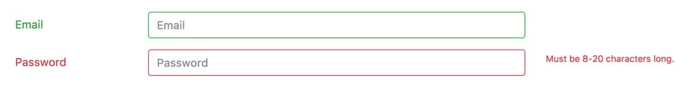
<div class="container">
  <form>
    <div class="form-group row">
      <label for="inputEmail" class="col-sm-2 col-form-label text-success">Email</label>
      <div class="col-sm-7">
        <input type="email" class="form-control is-valid" id="inputEmail" placeholder="Email">
      </div>
    </div>

    <div class="form-group row">
      <label for="inputPassword" class="col-sm-2 col-form-label text-danger">Password</label>
      <div class="col-sm-7">
        <input type="password" class="form-control is-invalid" id="inputPassword" placeholder="Password">
      </div>
      <div class="col-sm-3">
        <small id="passwordHelp" class="text-danger">
          Must be 8-20 characters long.
        </small>
      </div>
    </div>
  </form>
</div>
Bootstrap v3
をご覧ください。 ライブバージョン codepenに掲載
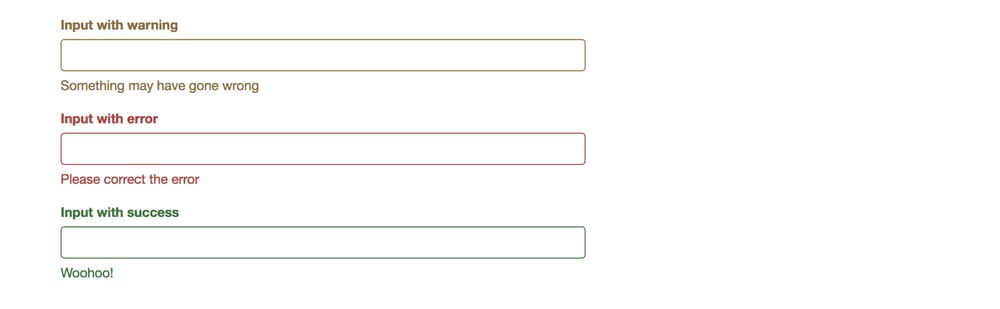
<form role="form">
  <div class="form-group has-warning">
    <label class="control-label" for="inputWarning">Input with warning</label>
    <input type="text" class="form-control" id="inputWarning">
    <span class="help-block">Something may have gone wrong</span>
  </div>
  <div class="form-group has-error">
    <label class="control-label" for="inputError">Input with error</label>
    <input type="text" class="form-control" id="inputError">
    <span class="help-block">Please correct the error</span>
  </div>
  <div class="form-group has-info">
    <label class="control-label" for="inputError">Input with info</label>
    <input type="text" class="form-control" id="inputError">
    <span class="help-block">Username is taken</span>
  </div>
  <div class="form-group has-success">
    <label class="control-label" for="inputSuccess">Input with success</label>
    <input type="text" class="form-control" id="inputSuccess" />
    <span class="help-block">Woohoo!</span>
  </div>
</form>
Bootstrap v2
をご覧ください。 ライブバージョン jsfiddleにて
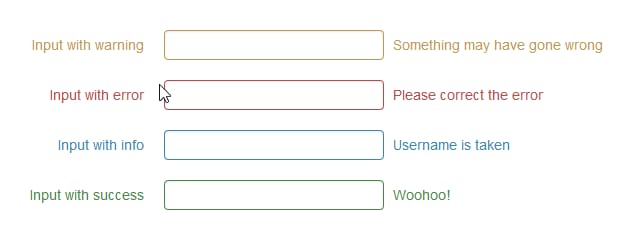
は
.error
,
.success
,
.warning
と
.info
クラスが追加されます。
.control-group
. これは、Bootstrap v2 の標準的なマークアップとスタイリングです。これに従えば、問題ありません。もちろん、独自のスタイルでポップアップやインラインフラッシュを追加することもできますが、Bootstrapの慣例に従って、検証クラスを
.control-group
を使えば、一貫性が保たれ、管理しやすくなります(少なくとも、Bootstrapのドキュメントやサンプルを利用し続けることができますから)。
  <form class="form-horizontal">
    <div class="control-group warning">
      <label class="control-label" for="inputWarning">Input with warning</label>
      <div class="controls">
        <input type="text" id="inputWarning">
        <span class="help-inline">Something may have gone wrong</span>
      </div>
    </div>
    <div class="control-group error">
      <label class="control-label" for="inputError">Input with error</label>
      <div class="controls">
        <input type="text" id="inputError">
        <span class="help-inline">Please correct the error</span>
      </div>
    </div>
    <div class="control-group info">
      <label class="control-label" for="inputInfo">Input with info</label>
      <div class="controls">
        <input type="text" id="inputInfo">
        <span class="help-inline">Username is taken</span>
      </div>
    </div>
    <div class="control-group success">
      <label class="control-label" for="inputSuccess">Input with success</label>
      <div class="controls">
        <input type="text" id="inputSuccess">
        <span class="help-inline">Woohoo!</span>
      </div>
    </div>
  </form>
関連
-
[解決済み] Twitter Bootstrapのメニューをクリックではなく、ホバーでドロップダウンさせる方法
-
[解決済み] Twitter Bootstrap 3を使用して列を中央に配置する
-
[解決済み] Bootstrapの列をすべて同じ高さにするにはどうしたらいいですか?
-
[解決済み] Bootstrap3による垂直方向の整列
-
[解決済み] BootstrapのモーダルウィンドウをjQueryで開くには?
-
[解決済み] Bootstrap 3 の sr-only とは何ですか?
-
[解決済み] Twitter Bootstrapでナビバーの色を変更する
-
[解決済み] Bootstrapのモーダルが背景の下に表示される
-
[解決済み] Twitter Bootstrap Form File Element Upload Button(ファイルアップロードボタン
-
[解決済み] Twitter Bootstrapを使った中央寄せのコンテンツはどうなっているのか?
最新
-
nginxです。[emerg] 0.0.0.0:80 への bind() に失敗しました (98: アドレスは既に使用中です)
-
htmlページでギリシャ文字を使うには
-
ピュアhtml+cssでの要素読み込み効果
-
純粋なhtml + cssで五輪を実現するサンプルコード
-
ナビゲーションバー・ドロップダウンメニューのHTML+CSSサンプルコード
-
タイピング効果を実現するピュアhtml+css
-
htmlの選択ボックスのプレースホルダー作成に関する質問
-
html css3 伸縮しない 画像表示効果
-
トップナビゲーションバーメニュー作成用HTML+CSS
-
html+css 実装 サイバーパンク風ボタン
おすすめ
-
[解決済み] Bootstrap 4のColでコンテンツを下に揃える方法
-
[解決済み] bootstrapでpanel-bodyの背景色を変更するには?
-
[解決済み] B-tableのBootstrapVue条件列
-
[解決済み] angular 2でbootstrap 4を使用するには?
-
[解決済み] Bootstrap v4におけるvisible-**とhidden-**の欠落について
-
[解決済み】TwitterのBootstrapを使ってインラインでリストを表示する方法
-
[解決済み] Bootstrap 3 のスタックドタブ
-
[解決済み] Twitter Bootstrapのホストバージョンはありますか?[クローズド]
-
[解決済み] Bootstrapのcolは右寄せ
-
[解決済み] Bootstrapでテーブルの上にカーソルを置くと、カーソルの色を変更するにはどうすればよいですか?