[CSSチュートリアル】CSSでデータホットスポット効果を実現する方法
2022-02-03 18:41:15
その効果は以下の通りです。
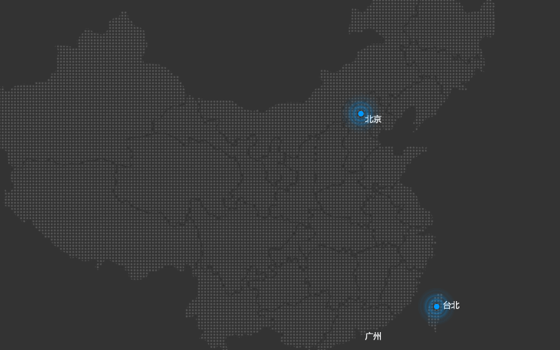
分析
1. ここに見えるのは、ポイントの周りにある3つの円であり、これがズームのアニメーションになっています。
<ブロッククオートつまり、4つのボックスポイント+3つのサークルと書きます。
<!DOCTYPE html>
<html lang="en">

<head>
    <meta charset="UTF-8">
    <meta name="viewport" content="width=device-width, initial-scale=1.0">
    <title>Document</title>
    <style>
        .city {
            width: 200px;
            height: 200px;
            background-color: gray;
            position: relative;
        }

        .pul {
            width: 8px;
            height: 8px;
            background-color: #09f;
            border-radius: 50%;
            top: 0;
            bottom: 0;
            left: 0;
            right: 0;
            margin: auto;
            position: absolute;
        }
        /* Select attributes with class names that start with pul */

        .city div[class^="pul"] {
            /* centered */
            top: 0;
            bottom: 0;
            left: 0;
            right: 0;
            margin: auto;
            position: absolute;
            width: 8px;
            height: 8px;
            border-radius: 50%;
            box-shadow: 0px 0px 10px #09f;
        }
    </style>
</head>

<body>
    <div class="city">
        <div class="pul"></div>
        <div class="pul1"></div>
        <div class="pul2"></div>
        <div class="pul3"></div>
    </div>
</body>

</html>

これを書いたら、3つの円をズームでアニメーションさせる必要がありますが、ご覧の通り、3つの円は同時にアニメーションを開始しないので、3つの円に異なる遅延を設定して、アニメーションを定義する必要があります。
/*define animation*/
  @keyframes pul {
            0% {}
            50% {
                width: 20px;
                height: 20px;
                opacity: 1;

            }

            100% {
                width: 50px;
                height: 50px;
                opacity: 0;
            }
        }
アニメーションの使用
.city>div:nth-child(2) {
            animation: pul 2s .5s linear infinite;
        }

        .city>div:nth-child(3) {
            animation: pul 2s 1s linear infinite;
        }

        .city>div:nth-child(4) {
            animation: pul 2s 1.5s linear infinite;
        }
その効果は次の通りです。
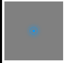
背景画像は自分で探せるので、ここには掲載しない。ダウンロードのために送るにはお金がかかるんです。
今回はcssを使ってデータホットスポット効果を実現する方法について紹介しましたが、もっと関連するcssデータホットスポットの内容はスクリプトハウスの過去記事を検索するか、以下の関連記事を引き続き閲覧してください、今後ともスクリプトハウスをもっと応援してくださいね。
関連
-
[CSSチュートリアル】Pure CSSカスタム複数行抜け問題(原理から実装まで)
-
[CSSチュートリアル】シングルセレクトの折りたたみメニュー機能を実現するCSS
-
[css3]CSS3タブアニメーションの背景切り替えの動的効果例
-
[css3]css3におけるtransformプロパティの4つの機能
-
[CSSチュートリアル】CSSで2カラムレイアウトを実現するN種類のメソッド
-
[CSSチュートリアル】CSSのクラスとidの共通命名規則
-
[CSSレイアウト例】CSSで中央揃えを実現する方法N種
-
[CSSチュートリアル】ピュアCSSで作るスクロールシャドウ効果
-
[CSSチュートリアル]モバイルにおけるviewportの具体的な使い方
-
[css3]CSS3+HTML5+JSでブロックの縮小・拡大アニメーション効果を実装する。
最新
-
nginxです。[emerg] 0.0.0.0:80 への bind() に失敗しました (98: アドレスは既に使用中です)
-
htmlページでギリシャ文字を使うには
-
ピュアhtml+cssでの要素読み込み効果
-
純粋なhtml + cssで五輪を実現するサンプルコード
-
ナビゲーションバー・ドロップダウンメニューのHTML+CSSサンプルコード
-
タイピング効果を実現するピュアhtml+css
-
htmlの選択ボックスのプレースホルダー作成に関する質問
-
html css3 伸縮しない 画像表示効果
-
トップナビゲーションバーメニュー作成用HTML+CSS
-
html+css 実装 サイバーパンク風ボタン
おすすめ
-
[CSSチュートリアル]cssのbackgroundとborderタグの例 詳細
-
[css3]css3はtransform-originを使用して、大きな円上のドット分布のレイアウトと回転を実現します。
-
[Div+CSSチュートリアル】divの背景を透明にする設定例
-
[css3]css3アニメーションマウスが絵の上に置かれると徐々に大きくなり、マウスが絵から離れると徐々に縮む効果
-
[CSSチュートリアル】ピュアCSSでDIVホバーを実現するサンプルコード(固定位置編)
-
[css3]赤いパケットのジッター効果を実現するCSS3
-
フロントエンドの落とし穴 リソースはスタイルシートとして解釈されるが、MIMEタイプはtext/htmlで転送される。"<URL>". css スタイルの失敗
-
[CSSチュートリアル】CSSを使ってボックスの水平・垂直方向の中央寄せを実現(全8種)
-
[css3]CSS3トランジションによる通知メッセージ回転バーの実装
-
[CSSチュートリアル】2要素ブレンド効果(スティッキー効果)を実現するCSS)