[CSSチュートリアル]CSSで簡単!高周波な異形ボタンを実現する方法
背景
グループ内の学生からは、CSSを使ってインナーカットボタンを実装する方法や、矢印のついたボタンを実装する方法などの質問がありました。 /{p
この記事では、デザイン原稿によく登場するちょっと難しくて厄介なボタンを元に、CSSを使ってできるだけ多くのボタンを実装する方法を解説しています。
まずは、よく登場するボタンの形から見ていきましょう。
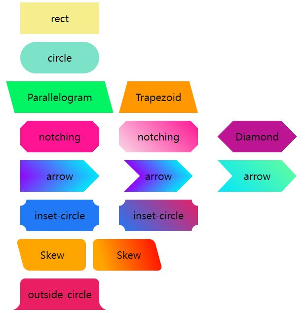
長方形と角丸のボタン
通常、私たちが目にするボタンは、長方形と角丸の2種類だけである。
幅と高さがあり、角が丸く、背景色がある、とてもシンプルなものです。
 <div class='btn rect'>rect</div>
    <div class='btn circle'>circle</div>
.btn {
    margin: 8px auto;
    flex-shrink: 0;
    width: 160px;
    height: 64px;
}
.rect {
    background: #f6ed8d;
}

.circle {
    border-radius: 64px;
    background: #7de3c8;
}
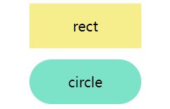
台形と平行四辺形
次に、矩形の変形を元に台形と平行四辺形のボタンを表示することが多いのですが、台形と平行四辺形では、矩形の変形を元に台形と平行四辺形のボタンを表示します。
これらを実装するには、主に
transform
を使用することができますが、注意しなければならないのは
transform
code /codeを使った後は、タグ内のテキストも変形してしまうので、通常は要素の疑似要素を使って形状を実現し、ボタン内のテキストに影響が出ないようにします。
平行四辺形
使用方法
transform: skewX()
つまり、要素の疑似要素を使って、中のテキストに影響を与えない平行四辺形を実現することについて、上で言われたことに注意してください。
<div class='btn parallelogram'>Parallelogram</div>
.parallelogram {
    position: relative;
    width: 160px;
    height: 64px;

    &::before {
        content: "";
        position: absolute;
        top: 0;
        left: 0;
        bottom: 0;
        right: 0;
        background: #03f463;
        transform: skewX(15deg);
    }
}
を除き、擬似要素を使用しない場合は、以下のようになります。
transform: skewX()
グラデーションで平行四辺形にすることも可能です。
おそらく、こんな感じになるのではないでしょうか。
{
    background: linear-gradient(45deg, transparent 22%, #04e6fb 22%, #9006fb 78%, transparent 0);
}
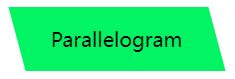
台形
台形は、平行四辺形より少し複雑で、その上に描画する
perspective
これは、実際にはいくつかの3次元変換を利用しています。原理は、このようにX軸を中心に回転する長方形です。

使用方法
perspective
と
transform: rotateX()
が機能しますが、もちろん、これらをまとめて次のように書くこともできます。
<div class='btn trapezoid'>Trapezoid</div>
.parallelogram {
    position: relative;
    width: 160px;
    height: 64px;

    &::after {
          content:"";
          position: absolute;
          top: 0; right: 0; bottom: 0; left: 0;
          transform: perspective(40px) rotateX(10deg);
          transform-origin: bottom;
          background: #ff9800;
    }
}
ソリッドとグラデーションの背景で手抜きをする
次に、カットコーナーグラフィックですが、最も一般的な方法は、主にグラデーションの助けを借りることです。
linear-gradient
このようなグラフを見てみましょう。
<div></div>
.notching {
    background: linear-gradient(135deg, transparent 10px, #ff1493 0);
    background-repeat: no-repeat;
}
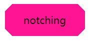
結果は次のようになります。

このことから、複数のグラデーションを使ったシェイプは4つだけ実装すればよく、さらにそのうちの1つである
background-position
の位置を四隅に設定します。
<div class="notching">notching</div>
.notching {
    background:
        linear-gradient(135deg, transparent 10px, #ff1493 0) top left,
        linear-gradient(-135deg, transparent 10px, #ff1493 0) top right, linear-gradient(-135deg, transparent 10px, #ff1493 0) top right,
        linear-gradient(-45deg, transparent 10px, #ff1493 0) bottom right,
        linear-gradient(45deg, transparent 10px, #ff1493 0) bottom left;
    background-size: 50% 50%;
    background-repeat: no-repeat;
}
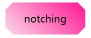
角刈りグラフィックのグラデーション背景を実現するクリップパス
もちろん、このトリックには問題があって、ベースカラーがグラデーションカラーであることが要求される場合には、ちょっと不格好になってしまう。
では、別の方法を紹介しましょう。
clip-path
を使ってコーナーカットアウトすることで、背景色をグラデーションでもソリッドでも、任意のカスタムカラーにすることができます。
<div class="clip-notching">notching</div>
.clip-notching {
    background: linear-gradient(
        45deg,
        #f9d9e7,
        #ff1493
    );
    clip-path: polygon(
        15px 0,
        calc(100% - 15px) 0,
        100% 15px,
        100% calc(100% - 15px),
        calc(100% - 15px) 100%,
        15px 100%,
        0 calc(100% - 15px),
        0 15px
    );
}
グラデーションの矩形グラフィックの上に、グラデーションの背景、それに続くコアの簡単な実装です。
clip-path: polygon()
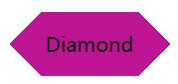
を使って、欲しい形(8角形)を切り取っています。
<イグ
もちろん、上記のコードは、下のような6角形の形状を彷彿とさせる、グラデーションを使った
clip-path
を使えば、どちらも簡単に手に入れることができる。
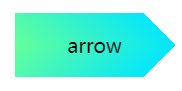
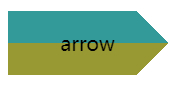
矢印ボタン
次に、矢印ボタンです。上の角を落としたボタンをよく見てください。両側の角を十分に落とすと、矢印の形になります。
二重のグラデーションを使って、一重の矢印ボタンを実装することができます:。
<div class="arrow">arrow</div>
&.arrow {
    background: linear-gradient(
                -135deg,
                transparent 22px,
                #04e6fb 22px,
                #65ff9a 100%
            )
            top right,
        linear-gradient(
                -45deg,
                transparent 22px,
                #04e6fb 22px,
                #65ff9a 100%
            )
            bottom right;
    background-size: 100% 50%;
    background-repeat: no-repeat;
}
から矢が出る。
上下のグラデーションブロックを組み合わせて得られるもので、色を変えればすぐに理解できる。
また、このような矢印の形だったらどうでしょう?
同様に、2つのグラデーションの重ね合わせで、グラデーションの色は透明 --> 色A --> 色B --> 透明です。もちろん、ここでも同じように
clip-path
:
Given here
clip-path
The solution for
{
    background: linear-gradient(45deg, #04e6fb, #65ff9a);
    clip-path: polygon(
        0 0,
        30px 50%,
        0 100%,
        calc(100% - 30px) 100%,
        100% 50%,
        calc(100% - 30px) 0
    );
}
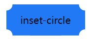
Inner cut rounded corners
The following button shape, mostly found in coupons, is the most common solution, also using a gradient, but of course, unlike the tangent corner, the radial gradient is used here.
First, look at a simple example like this.
<div></div>
div {
    background-image: radial-gradient(circle at 100% 100%, transparent 0, transparent 12px, #2179f5 12px);
}
One can get a graph like this.
 So, just control the
background-size
to achieve 4 of these graphics in 4 corners.
<div class="inset-circle">inset-circle</div>
&.inset-circle {
background-size: 70% 70%;
background-image: radial-gradient(
circle at 100% 100%,
transparent 0,
transparent 12px,
#2179f5 13px
),
radial-gradient(
circle at 0 0,
transparent 0,
transparent 12px,
#2179f5 13px
),
radial-gradient(
circle at 100% 0,
transparent 0,
transparent 12px,
#2179f5 13px
),
radial-gradient(
circle at 0 100%,
transparent 0,
transparent 12px,
#2179f5 13px
);
background-repeat: no-repeat;
background-position: right bottom, left top, right top, left bottom;
}
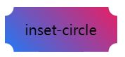
 Rounded inner corner button with gradient by mask
What if the background color requires a gradient?
Suppose we have a rectangular background pattern, and we just use
Rounded inner corner button with gradient by mask
What if the background color requires a gradient?
Suppose we have a rectangular background pattern, and we just use
mask
to implement a layer of masks, using the
mask
to mask out the 4 corners.
mask
The code is very similar to the rounded corner tangent code above, and can be simply modified to give a gradient inner tangent rounded corner button: <div class="mask-inset-circle">inset-circle</div>
.mask-inset-circle {
background: linear-gradient(45deg, #2179f5, #e91e63);
mask: radial-gradient(
circle at 100% 100%,
transparent 0,
transparent 12px,
#2179f5 13px
),
radial-gradient(
circle at 0 0,
transparent 0,
transparent 12px,
#2179f5 13px
),
radial-gradient(
circle at 100% 0,
transparent 0,
transparent 12px,
#2179f5 13px
),
radial-gradient(
circle at 0 100%,
transparent 0,
transparent 12px,
#2179f5 13px
);
mask-repeat: no-repeat;
mask-position: right bottom, left top, right top, left bottom;
mask-size: 70% 70%;
}
Thus, we get a graph like
 Of course, to understand the above code, you need to first figure out the CSS
mask
The principle of the attribute, if you are still a bit unfamiliar with it, can be found in this article of mine.
The wonderful CSS MASK
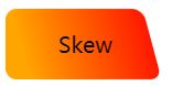
Rounded irregular rectangle
Here's the button shape, which has been asked about the most recently, starting with.
 Not a good name for it, with a regular right angle with rounded corners on one side and a beveled edge with rounded corners on the other.
Actually, it consists of a rounded rectangle + a rounded parallelogram:.
Not a good name for it, with a regular right angle with rounded corners on one side and a beveled edge with rounded corners on the other.
Actually, it consists of a rounded rectangle + a rounded parallelogram:.
 So they can be easily implemented with the help of two pseudo-elements.
<div class="skew">Skew</div>
.skew {
position: relative;
width: 120px;
&::after {
content: "";
position: absolute;
top: 0;
left: 0;
right: 0;
bottom: 0;
border-radius: 10px;
background: orange;
transform: skewX(15deg);
}
&::before {
content: "";
position: absolute;
top: 0;
right: -13px;
width: 100px;
height: 64px;
border-radius: 10px;
background: orange;
}
}
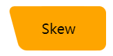 Since one pseudo-element is superimposed on the other, a gradient is used for one and a solid color for the other, whose colors are perfectly articulated so that the gradient color is achieved for this graphic:.
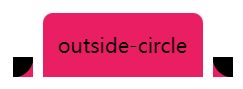
 Outer rounded corner button
The next button shape, commonly found on Tab pages, is similar to Chrome's pagination: the
Outer rounded corner button
The next button shape, commonly found on Tab pages, is similar to Chrome's pagination: the
 Let's break down this button shape, which is actually a stack of 3 blocks.
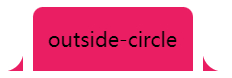 It's just a matter of figuring out how to achieve the curved triangle on both sides. Here again, with the help of a gradient -- a radial gradient, in fact -- he looks like this, as shown below, and we just need to replace the black part with a transparent one, using two pseudo-elements.
 The code is as follows.
<div class="outside-circle">outside-circle</div>
.outside-circle {
position: relative;
background: #e91e63;
border-radius: 10px 10px 0 0;
&::before {
content: "";
position: absolute;
width: 20px;
height: 20px;
left: -20px;
bottom: 0;
background: #000;
background:radial-gradient(circle at 0 0, transparent 20px, #e91e63 21px);
}
&::after {
content: "";
position: absolute;
width: 20px;
height: 20px;
right: -20px;
bottom: 0;
background: #000;
background:radial-gradient(circle at 100% 0, transparent 20px, #e91e63 21px);
}
}
which gives you.
 The full code for all of the above graphics you can see here.
CodePen Demo -- CSS Various Button Shapes | CSS Various Shaped Buttons
To summarize
Based on the above implementation, it is easy to see that some slightly special buttons are achieved by nothing more than splicing, baffling, masking, etc.
And in which.
gradient (linear gradient)
The full code for all of the above graphics you can see here.
CodePen Demo -- CSS Various Button Shapes | CSS Various Shaped Buttons
To summarize
Based on the above implementation, it is easy to see that some slightly special buttons are achieved by nothing more than splicing, baffling, masking, etc.
And in which.
gradient (linear gradient)
linear-gradient
Radial gradient
radial-gradient
(multiple gradients)
mask
mask
crop
clip-path
morph
transform
They play an important role, and by using them skillfully, we can have these shapes at our fingertips and face the transformations based on them with ease.
The above graphs, together with the
filter: drop-shadow()
to basically achieve irregular shadows.
Further, more complex graphics, as shown below.
 It's better to cut the image. CSS is good, but you need to consider the input-output ratio in practice.
Finally
The purpose of this article is more as a simple manual, in practice there may be better ways to achieve the above effect, this article is not a list, also welcome to add correction.
Well, this is the end of this article, I hope this article is helpful to you ????
More great CSS technical articles are summarized in my
Github -- iCSS
Please feel free to subscribe to the collection by clicking the star.
If you have any questions or suggestions, please feel free to share them with us.
This article about using CSS to easily achieve some high frequency odd-shaped button is introduced here, more related CSS odd-shaped button content please search the previous articles of the Codedevlib or continue to browse the following related articles, I hope you support the Codedevlib more in the future!
It's better to cut the image. CSS is good, but you need to consider the input-output ratio in practice.
Finally
The purpose of this article is more as a simple manual, in practice there may be better ways to achieve the above effect, this article is not a list, also welcome to add correction.
Well, this is the end of this article, I hope this article is helpful to you ????
More great CSS technical articles are summarized in my
Github -- iCSS
Please feel free to subscribe to the collection by clicking the star.
If you have any questions or suggestions, please feel free to share them with us.
This article about using CSS to easily achieve some high frequency odd-shaped button is introduced here, more related CSS odd-shaped button content please search the previous articles of the Codedevlib or continue to browse the following related articles, I hope you support the Codedevlib more in the future!
{
background: linear-gradient(45deg, #04e6fb, #65ff9a);
clip-path: polygon(
0 0,
30px 50%,
0 100%,
calc(100% - 30px) 100%,
100% 50%,
calc(100% - 30px) 0
);
}
div {
background-image: radial-gradient(circle at 100% 100%, transparent 0, transparent 12px, #2179f5 12px);
}
<div class="inset-circle">inset-circle</div>
関連
-
[CSSチュートリアル】CSS擬似要素::マーカー解説
-
[CSSチュートリアル]cssの位置固定コードで左右2重の位置決め
-
[CSSチュートリアル】ボックス内の複数要素を両端揃えの効果で実現するCSS
-
[CSSチュートリアル】CSSカウンターを使った数字の並びの美化方法
-
[css3]CSS3は本当にSCSSに取って代わるのだろうか?
-
[CSSチュートリアル】テーブルの最大幅と最小幅の相性問題と解決策を解説
-
[CSSチュートリアル】ピュアCSSでロウソクの溶ける(水滴)を実現するサンプルコード
-
[CSSレイアウト例】6種類の適応的な2カラムレイアウトを実現するCSS
-
[CSSチュートリアル】CSSスタイルをプログラムで処理するサンプルコード
-
[css3]css3は、最初と最後のテキスト実行例を実現するためのコード
最新
-
nginxです。[emerg] 0.0.0.0:80 への bind() に失敗しました (98: アドレスは既に使用中です)
-
htmlページでギリシャ文字を使うには
-
ピュアhtml+cssでの要素読み込み効果
-
純粋なhtml + cssで五輪を実現するサンプルコード
-
ナビゲーションバー・ドロップダウンメニューのHTML+CSSサンプルコード
-
タイピング効果を実現するピュアhtml+css
-
htmlの選択ボックスのプレースホルダー作成に関する質問
-
html css3 伸縮しない 画像表示効果
-
トップナビゲーションバーメニュー作成用HTML+CSS
-
html+css 実装 サイバーパンク風ボタン
おすすめ
-
[CSSチュートリアル]z-indexの違い。cssのz-index: 0とz-index: autoの違い。
-
[CSSチュートリアル】波動効果を生み出すCSSのアイデア
-
[CSSチュートリアル】CSSでemを開く正しい方法 詳細へ
-
[CSSチュートリアル】CSSで実現するイメージマッピングメソッド
-
[css3] scss変数の値を実行時に変更するcss3 var()の使用方法を説明します。
-
[css3]Apple携帯電話のロック解除のためのCSS3サンプルフォントシャインエフェクト
-
[css3] CSS3を使ってヘッダーアニメーション効果を作成する
-
[css3]CSS3アニメーションによる光のボタンの流れの効果
-
[CSSチュートリアル]適応的な幅と高さの矩形の16:9の例を達成するためのCSS
-
左上または右上にリマインダーのドットを表示するCSS3サンプルコード[CSSチュートリアル