[CSSチュートリアル]適応的な幅と高さの矩形の16:9の例を達成するためのCSS
2022-02-02 04:22:28
先ほど、適応的な幅:高さが1:1の正方形を作る方法についてお話しました
https://www.jb51.net/css/753385.html
それでは、アダプティブな16:9の矩形を作るために必要なことを説明します。
まず最初に高さを計算します。横幅を100%とすると、高さはh=9/16=56.25%になります。
第二段階は、先ほどの set-padding-bottom メソッドを使って、矩形を実現します。
<style>
*{
margin: 0px;
padding: 0px;
}
/* .wrap:wrap rectangle div, used to control the size of the rectangle */
.wrap{
width: 20%;
}
/* .box rectangular div, width is 100% of .wrap, this is mainly to facilitate the height calculation */
.box{
width: 100%;
/* prevent the rectangle from being propped up with extra height by the content inside */
height: 0px;
/* 16:9padding-bottom:56.25%, 4:3padding-bottom:75% */
padding-bottom: 56.25%;
position: relative;
background: pink;
}
/* The content inside the rectangle , to set position: absolute, in order to set the content height 100% and the same as the rectangle */
.box p{
width: 100%;
height: 100%;
position: absolute;
color: #666;
}
</style>
<body>
<div class="wrap">
<div class="box">
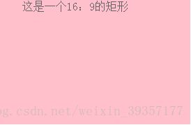
<p> This is a 16:9 rectangle</p>
</div>
</div>
</body>
同様に、異なるスケールの矩形は、このように実装することができます。
以上で、16:9の幅に適応した矩形のCSSサンプルについての記事を終わります。CSS の幅適応型矩形については、過去の記事を検索するか、以下の記事を引き続きご覧ください。
関連
-
[CSSチュートリアル】QQtabBarからCSS命名規則BEMの詳細を見る
-
[CSSチュートリアル】Chromeのタブバーを実装するためのCSSのコツ
-
[CSSチュートリアル】overflow:hiddenの役割を解説(overflow hidden、clear float、外周マージンの崩れを解決する)。
-
[CSSチュートリアル]テーブル table :nth-child()を使って行間の色変更と整列を実現する。
-
[css3]CSS3遷移回転遠近法2D3Dアニメーションなどの効果を持つサンプルコード
-
[CSSチュートリアル】画面全体に広がるアダプティブな高さを実現するCSS
-
[CSSチュートリアル]overflow:autoの使い方解説
-
[CSSチュートリアル]CSS線形グラデーションの凹型矩形遷移の動的効果
-
[css3]テキストタイポグラフィのためのCSS3テキストオーバーフローソリューション
-
[CSSチュートリアル】display:olck/noneでメニューバーを完成させる方法
最新
-
nginxです。[emerg] 0.0.0.0:80 への bind() に失敗しました (98: アドレスは既に使用中です)
-
htmlページでギリシャ文字を使うには
-
ピュアhtml+cssでの要素読み込み効果
-
純粋なhtml + cssで五輪を実現するサンプルコード
-
ナビゲーションバー・ドロップダウンメニューのHTML+CSSサンプルコード
-
タイピング効果を実現するピュアhtml+css
-
htmlの選択ボックスのプレースホルダー作成に関する質問
-
html css3 伸縮しない 画像表示効果
-
トップナビゲーションバーメニュー作成用HTML+CSS
-
html+css 実装 サイバーパンク風ボタン
おすすめ
-
[CSSチュートリアル】カットコーナー+ボーダー+プロジェクション+コンテンツ背景色のグラデーション効果を実現するCSS
-
[CSSチュートリアル】CSS たった1行のコードでアバターと国旗の一体化を実現
-
[CSSレイアウト例】float(フロート)、position(ポジション)プロパティの差分によるCSSレイアウト
-
[CSSチュートリアル】ネイティブCSSでテキストの無制限回転を実現する汎用的な方法
-
[Div+CSSチュートリアル】divの背景を透明にする設定例
-
[CSSチュートリアル】タイトルを上部に配置するスティッキーレイアウトを実現するためのCSS
-
[CSSチュートリアル】ピュアCSSでDIVホバーを実現するサンプルコード(固定位置編)
-
[CSSチュートリアル】CSSを使ってボックスの水平・垂直方向の中央寄せを実現(全8種)
-
[CSSチュートリアル】Display, Visibility, Opacity, rgba, z-indexのcss。-1差分
-
[CSSチュートリアル】ピュアCSS3による水平無限スクロールのサンプルコード