[CSSチュートリアル]overflow:autoの使い方解説
2022-02-02 08:50:14
本文に入る前に、オーバーフローとフレックスレイアウトの使い方を紹介します。
overflow: auto; コンテンツが切り取られている場合、ブラウザは残りのコンテンツを見るためにスクロールバーを表示します。
フレックスでのプロパティ
display: フレックス。
flex-direction: column; スピンドルは上端を起点に垂直方向です。
オーバーフローとフレックスレイアウトを併用
コードは以下の通りです。
<!DOCTYPE html>
<html>
<head>
    <meta charset="utf-8">
    <title>usage of overflow:auto</title>
    <meta name="viewport" content="width=device-width, initial-scale=1, maximum-scale=1, user-scalable=no" />
    <link rel="stylesheet" type="text/css" href="css/reset.css" />

    <style type="text/css">
        html,body{
            width: 100%;
            height: 100%;
        }
        .container{
            width: 100%;
            height: 100%;
            display: flex;
            flex-direction: column;
        }
        .header{
            width: 100%;
            height: 100px;
            background: #f99;
        }
        .content{
            width: 100%;
            height: 100%;
            overflow: auto;
            background: yellow;
            flex: 1;
        }
        .footer{
            width: 100%;
            height: 100px;
            background: #99f;
        }
    </style>
</head>
<body>
    <div class="container">
        <div class="header">

        </div>
        <div class="content">
            <ul>
                <li>111111</li>
                <li>11111</li>
                <li>11111</li>
                <li>11111</li>
                <li>11111</li>
                <li>11111</li>
                <li>11111</li>
                <li>111111</li>
                The li here should be written more so that it will show the effect, I am trying to save space here.
            </ul>
        </div>

        <div class="footer">
        </div>
    </div>
</body>
</html>
overflow: auto;の効果を得るには、まずレイアウトし、次にスタイルを書きます。
一番外側の親ボックスであるcontainerにスタイルを付けるには、以下のようなスタイルを追加します。
.container{
    width: 100%;
    height: 100%;
    display: flex;
    flex-direction: column;
}
また、html と body の幅と高さは必ず 100% にしてください。
html,body{
    width: 100%;
    height: 100%;
}
ヘッダーとボトムは固定の高さが与えられており、WeChatのようなアプリでは一般的なものです。
.header{
    width: 100%;
    height: 100px;
    background: #f99;
}
.footer{
    width: 100%;
    height: 100px;
    background: #99f;
}
真ん中のコンテンツにはflex: 1が与えられ、私たちのリードのoverflow: autoで、overflowは自動的にクロップされます。
.content{
    width: 100%;
    height: 100%;
    overflow: auto;
    background: yellow;
    flex: 1;
    }
レンダリングは次のようになります。
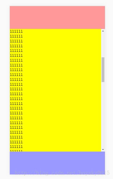
中央のコンテンツエリアは上下にスライドさせることができ、余分な部分は自動的に切り取られます。
以下は、私がreactで書いた、WeChatのチャットウィンドウを模した小さなプロジェクトです。
overflow:autoの使い方についての記事は以上です。overflow:autoの使い方については、Script Houseの過去の記事を検索するか、以下の記事を引き続き閲覧してください。
関連
-
[CSSチュートリアル】CSSのfloatとunfloatについて
-
[CSSチュートリアル】CSSを解析して、画像のテーマカラー機能を抽出する(コツ)
-
[CSSチュートリアル】擬似要素で実現する中空三角矢印とXアイコンの例
-
[CSSチュートリアル】インタビュー必見!聖杯レイアウトとダブルウィングレイアウトの違いとは?
-
cssにおけるpx, em, rem, ptの特徴や違い、変換の詳細について
-
[CSSチュートリアル】CSSで粘着効果をつけてみる方法
-
[css3]CSS3:overflowプロパティ
-
[CSSレイアウト例】フレックスレイアウトを使って簡単にページレイアウトを実現するサンプルコード
-
[css3]CSS3トランジションによる通知メッセージ回転バーの実装
-
[CSSチュートリアル]なぜheadタグにcssを入れるのか?
最新
-
nginxです。[emerg] 0.0.0.0:80 への bind() に失敗しました (98: アドレスは既に使用中です)
-
htmlページでギリシャ文字を使うには
-
ピュアhtml+cssでの要素読み込み効果
-
純粋なhtml + cssで五輪を実現するサンプルコード
-
ナビゲーションバー・ドロップダウンメニューのHTML+CSSサンプルコード
-
タイピング効果を実現するピュアhtml+css
-
htmlの選択ボックスのプレースホルダー作成に関する質問
-
html css3 伸縮しない 画像表示効果
-
トップナビゲーションバーメニュー作成用HTML+CSS
-
html+css 実装 サイバーパンク風ボタン
おすすめ
-
[CSSチュートリアル]CSSで簡単!高周波な異形ボタンを実現する方法
-
[CSSチュートリアル]cssのbackgroundとborderタグの例 詳細
-
[css3]css3はtransform-originを使用して、大きな円上のドット分布のレイアウトと回転を実現します。
-
[CSSチュートリアル】CSSでemを開く正しい方法 詳細へ
-
[css3]グレーモードやブラックモードを実現するCSS3フィルター(フィルター)サンプルコード(Webページ用
-
[CSSチュートリアル】ピュアCSSで実装した通知バーの3種類のスクロール効果
-
[css3]CSS3アニメーションによる光のボタンの流れの効果
-
フロントエンドの落とし穴 リソースはスタイルシートとして解釈されるが、MIMEタイプはtext/htmlで転送される。"<URL>". css スタイルの失敗
-
[CSSチュートリアル】CSSでマウスの位置をマッピングし、マウスの動きでページ要素を制御する効果を実現する(コード例)
-
[CSSチュートリアル] Pure CSS to click to expand もっと読む