4種類のプログラムの画面適応に応じたモバイルh5ページを説明する。
方法1:タオバオのオープンソースのスケーラブルなレイアウトスキームを導入する。
タオバオのオープンソースのスケーラブルなレイアウトスキームを紹介します。 https://github.com/amfe/lib-flexible (クリックすると拡大します)
タオバオのも実はビューポートのものと少し似ていますが、主にデバイスのデバイスピクセル比に基づいてスケールの値を設定し、ビューポートのデバイス幅を常にデバイスの物理ピクセルと同じに保ち、画面サイズは動的にルートフォントサイズを計算し、具体的には画面を10等分して計算するのです。この部分は、後述するように、jsで直接実装することも可能です。
導入方法や使い方の詳細は、githubに移動して非常に詳しく見ることができます。
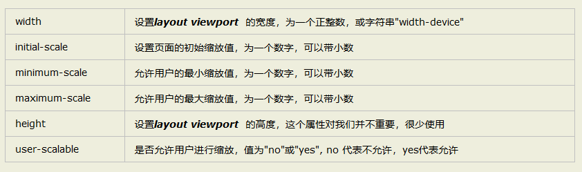
方法2:ビューポートを利用する
viewportの使用方法はgithubに記載されています。お急ぎの方は、引き続き下記の概要図をご覧ください。
https://www.jb51.net/article/149140.htm (クリックすると拡大します)
ビューポートについては、上記の記事からの直接の引用ですが、これも最もすっきりとした直接的なまとめだと感じます。
方法3:js+viewportを使用して手動適応のremを動的に設定する。
私のエディタはvscodeですが、プラグインのcssremを追加して、自動的に
index.html
<!DOCTYPE html>
<html>
  <head>
    <meta charset="utf-8">
    <! -- <meta name="viewport" content="width=device-width,initial-scale=1.0"> -->
    <meta name="viewport" content="width=device-width,initial-scale=1.0,minimal-scale=1.0,maximum-scale=1.0,user- scalable=no" />
    <! -- Enable 360 browser's extreme mode (webkit) -->
    <meta name="renderer" content="webkit">
    <! -- avoid IE using compatibility mode -->
    <meta http-equiv="X-UA-Compatible" content="IE=edge">
    <! -- optimized for handheld devices, mainly for older browsers that don't recognize viewport, like Blackberry -- >
    <meta name="HandheldFriendly" content="true">
    <! -- Microsoft's old browser -- >
    <meta name="MobileOptimized" content="320">
    <! -- uc force vertical screen -->
    <meta name="screen-orientation" content="portrait">
    <! -- QQ forced vertical screen -->
    <meta name="x5-orientation" content="portrait">
    <! -- UC forced fullscreen -->
    <meta name="full-screen" content="yes">
    <! -- QQ force full screen -->
    <meta name="x5-fullscreen" content="true">
    <! -- UC application mode -->
    <meta name="browsermode" content="application">
    <! -- QQ application mode -->
    <meta name="x5-page-mode" content="app">
    <! -- windows phone click no highlight -->
    <meta name="msapplication-tap-highlight" content="no">
    <meta content="telephone=no" name="format-detection" />
    <meta name="huaban" content="nopin" />
    <link rel="icon" type="image/x-icon" href="/favicon.ico">
    <title>新茶飲</title>
    <script src="/config.js"></script>
   <script src="http://res.wx.qq.com/open/js/jweixin-1.0.0.js"></script>
  </head>
  <body>
    <div id="app"></div>
    <! --
    In iphone 5 1rem=16px;
    html font-size =16px=1rem;
  -->
  <script>
    //Get the width of the phone screen
    let htmlWidth = document.documentElement.clientWidth || document.body.clientWidth;
    console.log('htmlWidth',htmlWidth)
    //get html's Dom element
    let htmlDom = document.getElementsByTagName('html')[0];
    // if(htmlWidth>640){// over 640 size, the font root are 16px
    // htmlWidth=640;
    // console.log('htmlWidth-true',htmlWidth)
    // }
    // Set the font size of the root element
    htmlDom.style.fontSize = htmlWidth / 40 + 'px';

  </script>

  </body>
</html>
方法4:cssのメディアクエリに基づいて、ルートhtmlのフォントサイズを動的に設定する。
html {font-size: 625%; /*100 ÷ 16 × 100% = 625%*/}

@media screen and (min-width:360px) and (max-width:374px) and (orientation:portrait) {
    html { font-size: 703%; }
}
@media screen and (min-width:375px) and (max-width:383px) and (orientation:portrait) {
    html { font-size: 732.4%; }
}
@media screen and (min-width:384px) and (max-width:399px) and (orientation:portrait) {
    html { font-size: 750%; }
}
@media screen and (min-width:400px) and (max-width:413px) and (orientation:portrait) {
    html { font-size: 781.25%; }
}
@media screen and (min-width:414px) and (max-width:431px) and (orientation:portrait){
    html { font-size: 808.6%; }
}
@media screen and (min-width:432px) and (max-width:479px) and (orientation:portrait){
    html { font-size: 843.75%; }
}
画面適応に基づくモバイルh5ページの4つのオプションについてのこの記事はすべてです、より関連する画面適応に基づくモバイルh5コンテンツは、スクリプトハウスの過去の記事を検索するか、次の関連記事を閲覧を続けてください、私はあなたが将来的にもっとスクリプトハウスをサポートすることを願っています!。
関連
-
ピクセル画像を描画するCanvasのサンプルコード
-
HTML5 回転画像フルコード
-
CAPTCHAを生成するHTML5サンプルコード
-
AmazeUIのJSフォーム検証フレームワークの動作を公開
-
シェアボタン付きAmazeUIボトムナビゲーションバー用サンプルコード
-
h5ページ evokeアプリがインストールされていない場合、ダウンロードにジャンプします(iOS、Android)。
-
携帯電話のHtml5を達成するためにカメラのメソッドを呼び出すには
-
Html5ポジショニングの究極のソリューション
-
html2canvasを使ってcanvasにhtmlの内容を書き込んで画像を生成する方法
-
HTML5タイマーrequestAnimationFrameの使い方を深く理解する。
最新
-
nginxです。[emerg] 0.0.0.0:80 への bind() に失敗しました (98: アドレスは既に使用中です)
-
htmlページでギリシャ文字を使うには
-
ピュアhtml+cssでの要素読み込み効果
-
純粋なhtml + cssで五輪を実現するサンプルコード
-
ナビゲーションバー・ドロップダウンメニューのHTML+CSSサンプルコード
-
タイピング効果を実現するピュアhtml+css
-
htmlの選択ボックスのプレースホルダー作成に関する質問
-
html css3 伸縮しない 画像表示効果
-
トップナビゲーションバーメニュー作成用HTML+CSS
-
html+css 実装 サイバーパンク風ボタン
おすすめ
-
HTML5ページオーディオの自動再生実装
-
画像のウォーターフォールレイアウトを実現するHTML+CSS+JSのサンプルコード
-
h5モバイルコール Alipay、WeChat決済の実装
-
Html5 Streamを用いたリアルタイムモニタリングシステムの開発
-
入力ボックスの種類が数字のときに上下の矢印を消すHTML5メソッド
-
html5 色彩公差キーイング with canvas
-
html5モバイルキーボードのポップアップを片付ける対応
-
キャンバスを使用して、実装の画像にタイル状の透かしを追加することを教える手
-
iphoneXの前髪スクリーンに合わせたHtml5の簡易実装
-
HTML5ページシームレス点滅オープン問題と解決策