AmazeUI モバイルページ トップナビゲーションバー ヘッダーとサイドナビゲーションバー offCanvas サンプルコード
2022-01-12 18:49:53
最近のページに注目すると、トップナビゲーションバーはあまりにも一般的です。このコンポーネントは、フロントエンドフレームワークであるAmazeUIを使えば、モバイルページにも実装することが可能です。同時に、ナビゲーションバーの右端にサイドナビゲーションバーoffCanvasを追加し、一度クリックすると巨大なドロップダウン型ナビゲーションとなるBootStrapの使用をやめることができます。ナビゲーションは、ページ上で多くのスペースを占めます。このサイドナビゲーションバーoffCanvasは、以前はWorkPressの優れたデザインのphp側だったのですが、今はどうでしょうか?
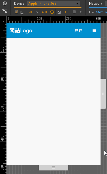
AmazeUIを使った結果はこのようになります。
まず、トップナビゲーションバーのコードです。
<! -- The top navigation bar here is the same as Bootstrap and is also only available in shades of light and dark. The only difference is that Bootstrap is gray and black and AmazeUI is gray and blue. Removing am-topbar-inverse shows gray - >
        <div class="am-topbar am-topbar-inverse">
            <h1 class="am-topbar-brand">
           		<a href="#">WebsiteLogo</a>
            </h1>
            <div class="am-topbar-right am-fr">
            <! -- On the far right of the navigation bar, define two buttons, one as text to jump to other pages, and one as a button to trigger the sidebar. -->
                <button class="am-topbar-btn am-btn am-btn-sm am-btn-primary" onClick="javascript:window.location.href='#'"> Other</button>
                <button class="am-topbar-btn am-btn am-btn-sm am-btn-primary" data-am-offcanvas="{target: '#offcanvasId'}">< ;span class="am-icon-bars"></span></button>
            </div>
		</div>
続いて、サイドバーのコードです。
つまり、ページ全体のコードは次のようになります。
<! -- Developing with HTML5 -->
<!doctype html>
<html class="no-js">
<html>
    <head>
        <meta http-equiv="Content-Type" content="text/html; charset=utf-8">
        <meta http-equiv="X-UA-Compatible" content="IE=edge">
        <! -- Auto-adapt to mobile screens -->
        <meta name="viewport" content="width=device-width, initial-scale=1, maximum-scale=1, user-scalable=no">
        <! -- Preferred rendering with webkit kernel -->
        <meta name="renderer" content="webkit">
        <! -- don't be transcoded by Baidu -- >
        <meta http-equiv="Cache-Control" content="no-siteapp"/>
        <! -- The following is what introduces the amazeui resource -- >
        <link rel="stylesheet" href="assets/css/amazeui.min.css">
        <link rel="stylesheet" href="assets/css/app.css">
        <! -- When introducing js, note that jQuery must be introduced first, then amazeui, because the framework is based on jQuery -- >
        <script src="assets/js/jquery.min.js"></script>
        <script src="assets/js/amazeui.min.js"></script>
        <title>Header</title>
    </head>

    <body>
    	<! -- The top navigation bar here is the same as Bootstrap's, which also offers only dark and light colors. The only difference is that Bootstrap is gray and black, while AmazeUI is gray and blue. Removing am-topbar-inverse shows gray - >
        <div class="am-topbar am-topbar-inverse">
            <h1 class="am-topbar-brand">
           		<a href="mIndex-index.html">WebsiteLogo</a>
            </h1>
            <div class="am-topbar-right am-fr">
            <! -- On the far right of the navigation bar, define two buttons, one as text to jump to other pages, and one as a button to trigger the sidebar. -->
                <button class="am-topbar-btn am-btn am-btn-sm am-btn-primary" onClick="javascript:window.location.href='#'"> Other</button>
                <button class="am-topbar-btn am-btn am-btn-sm am-btn-primary" data-am-offcanvas="{target: '#offcanvasId'}">< ;span class="am-icon-bars"></span></button>
            </div>
		</div>
        <! -- Sidebar content -->
        <div id="offcanvasId" class="am-offcanvas">
            <div class="am-offcanvas-bar">
                <div class="am-offcanvas-content">
                    <ul class="am-menu-nav am-avg-sm-1">
                        <li class="">Sidebar menu</li>
                        <li>----------</li>
                        <li><a href="#">Function 1</a></li>
                        <li><a href="#">Function 2</a></li>
                        <li><a href="#">Function 3</a></li>
                    </ul>
                </div>
            </div>
        </div>
        <! --In the next breath, you're free to play around. -->
	</body>
</html>
注目すべきは、このトップナビゲーションバーHeaderは、スクロールバーをどのようにスクロールさせても、Headerの上にホバーが表示されないことです。あくまで、通常のコンテンツのページと同等です。
要約する
トップナビゲーションバーヘッダーとサイドナビゲーションバーoffCanvasサンプルコードのAmazeUIモバイル版に関するこの記事は、これに導入され、より関連AmazeUIトップナビゲーションバーヘッダーとサイドナビゲーションバーoffCanvasコンテンツは、スクリプトホーム以前の記事を検索するか、次の関連記事を閲覧し続け、あなたが後で私はあなたがよりスクリプト家をサポートしています願っていますよ。
関連
-
ログイン期限切れでIframフレームワークから飛び出す方法を説明する
-
amazeuiのページチェック機能を実装するためのコード
-
html5 モバイルアダプティブレイアウトの実装
-
Html5によるマンドモバイル活用の甌穴(おうけつ)踏査
-
高解像度画面でのキャンバスブラーの問題を記憶する
-
複数の画像を編集するためのキャンバス画像エディタの実装方法
-
キャンバスの描画がぼやける問題の解決法
-
HTML5新フォームコントロールとフォームプロパティのサンプルコード詳細
-
canvas 学習のまとめ III - パスの描画 - ラインセグメント
-
ビデオグリーンスクリーンキーイングのキャンバスピクセルポイントマニピュレーション
最新
-
nginxです。[emerg] 0.0.0.0:80 への bind() に失敗しました (98: アドレスは既に使用中です)
-
htmlページでギリシャ文字を使うには
-
ピュアhtml+cssでの要素読み込み効果
-
純粋なhtml + cssで五輪を実現するサンプルコード
-
ナビゲーションバー・ドロップダウンメニューのHTML+CSSサンプルコード
-
タイピング効果を実現するピュアhtml+css
-
htmlの選択ボックスのプレースホルダー作成に関する質問
-
html css3 伸縮しない 画像表示効果
-
トップナビゲーションバーメニュー作成用HTML+CSS
-
html+css 実装 サイバーパンク風ボタン