[CSSチュートリアル】cssフレックスレイアウト ロング自動改行サンプルコード
2022-01-12 21:32:11
フレックスコンテナを作成するには、要素に display: flex 属性を追加するだけです。
デフォルトでは、すべての直接の子要素はフレックスアイテムとみなされ、左から右へ一列に並べられます。
フレックスアイテムの合計がコンテナより幅が広い場合、フレックスコンテナの幅Demoに収まるまでフレックスアイテムが縮小されます。ページを見つけてf12キーを押し、div内の複数のdiv要素の組み合わせを見つけ、flexとwidth: 900pxを宣言し、後の練習自動改行ができるように固定幅を与える
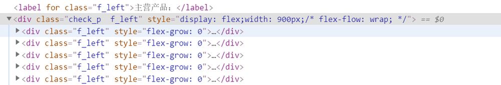
再度、コンソールCSSで以下のようにスタイリングします。
画像
得ることができます。明らかに、これはフレックス期間が縮小されることを確認するものです
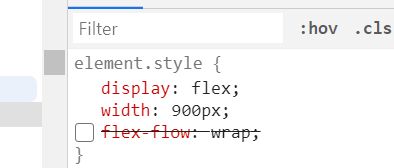
ここで、親要素に以下のように「flex-flow: wrap;」を追加する必要があります。
画像
最終効果
画像
その他の参考文献
display: flex;

/* flex-direction determines the direction of the main axis row(default)|row-reverse|column|column-reverse*/
/* flex-direction: row; */

/* flex-wrap determines whether and how to change rows when the alignment does not fit, nowrap(default)|wrap|wrap-reverse */
/* flex-wrap:wrap; */

/* flex-flow is a shorthand form of lex-direction and flex-wrap, e.g. row wrap|column wrap-reverse, etc. The default value is row nowrap, which means horizontal alignment without line breaks */
flex-flow:row wrap;

/* ! justify-content, which determines the alignment of the item on the main axis. The possible values are flex-start (default), flex-end, center, space-between, space-around */
justify-content:center;
/* ! when the main axis is horizontal! determines the alignment of the item on the cross-axis, possible values are flex-start|flex-end|center|baseline|stretch */
align-items:center;
例 CSS Flex フレキシブルレイアウト (複数 div の自動改行)
<!DOCTYPE html>
<html>
<head>
    <meta charset="UTF-8">
    <meta name="viewport" content="width=device-width, initial-scale=1.0">
    <meta http-equiv="X-UA-Compatible" content="ie=edge">
    <title>Flex layout</title>
    <style>
        .con {
            /* To create a flex container, simply add a display: flex attribute to an element. */
            /* By default, all direct child elements are considered flex items and are arranged in a row in order from left to right. */
             /* If the total width of flex items is greater than the container, then flex items will be scaled down until they fit the flex container width */
            display: flex;
            /* flex-direction determines the direction of the main axis row(default)|row-reverse|column|column-reverse*/
            /* flex-direction: row; */
            /* flex-wrap determines whether and how to change rows when the alignment does not fit, nowrap(default)|wrap|wrap-reverse */
            /* flex-wrap:wrap; */
            /* flex-flow is a shorthand form of lex-direction and flex-wrap, e.g. row wrap|column wrap-reverse, etc. The default value is row nowrap, which means horizontal alignment without line breaks */
            flex-flow: row wrap;
            /* ! justify-content, which determines the alignment of the item on the main axis. The possible values are flex-start (default), flex-end, center, space-between, space-around */
            justify-content: center;
            /* ! When the main axis is horizontal! determines how the item is aligned on the cross-axis, possible values are flex-start|flex-end|center|baseline|stretch */
            align-items: center;
        }

            .con > div {
                width: 100px;
                height: 100px;
                background: #8DB6CD;
                border: 1px solid black;
                margin-left: 10px;
                text-align: center;
                line-height: 100px;
            }
    </style>
</head>
<body>
    <div class='con'>
        <! -- The value of order is an integer, the default is 0, the smaller the integer, the more forward the item is arranged Here only set the order attribute for item1 and item4 1 and 4 are arranged at the end, and 4 is in front of 1 -->
        <div style="order: 2">item 1</div>
        <div style="height: 300px;">item 2</div>
        <! -- flex-grow defines whether the item is enlarged when there is extra space in the flex container flex-shrink is shrink -->
        <div style="flex-grow:2">item 3</div>
        <div style="order: 1">item 4</div>
        <div style="flex-basis:60px">item 5</div>
        <div>item 6</div>
        <div>item 7</div>
        <div>item 8</div>
        <div>item 9</div>
        <div>item 10</div>
        <div>item 11</div>
    </div>
</body>
</html>
cssフレックスレイアウト長い自動改行例コードについてのこの記事は、これに導入され、より関連するcssフレックス長い自動改行の内容は、スクリプトハウス以前の記事を検索するか、次の関連記事を閲覧を続けてください、あなたは将来的にもっとスクリプトハウスをサポートして願っています!。
関連
-
[CSSチュートリアル】CSSでemを開く正しい方法 詳細へ
-
[CSSチュートリアル】CSSカウンターを使った数字の並びの美化方法
-
[CSSチュートリアル】CSSで炎のエフェクトを記述する方法
-
[CSSチュートリアル]CSS動的高さ遷移のアニメーション効果の実装の
-
[css3] CSS3を使ってヘッダーアニメーション効果を作成する
-
[css3]赤いパケットのジッター効果を実現するCSS3
-
[CSSチュートリアル】インタビュー必見!聖杯レイアウトとダブルウィングレイアウトの違いとは?
-
[Web標準チュートリアル】html5+CSS3コーディング規約
-
[css3]css3のtransformの遷移のジッターの問題を解決しました。
-
[CSSチュートリアル】2要素ブレンド効果(スティッキー効果)を実現するCSS)
最新
-
nginxです。[emerg] 0.0.0.0:80 への bind() に失敗しました (98: アドレスは既に使用中です)
-
htmlページでギリシャ文字を使うには
-
ピュアhtml+cssでの要素読み込み効果
-
純粋なhtml + cssで五輪を実現するサンプルコード
-
ナビゲーションバー・ドロップダウンメニューのHTML+CSSサンプルコード
-
タイピング効果を実現するピュアhtml+css
-
htmlの選択ボックスのプレースホルダー作成に関する質問
-
html css3 伸縮しない 画像表示効果
-
トップナビゲーションバーメニュー作成用HTML+CSS
-
html+css 実装 サイバーパンク風ボタン
おすすめ
-
cssで背景色の半透明化を実現する2つの方法
-
[CSSチュートリアル]cssのbackgroundとborderタグの例 詳細
-
[CSSチュートリアル】パララックススクロールの効果を完成させるCSS
-
[CSSレイアウト例】CSSで中央揃えを実現する方法N種
-
[CSSチュートリアル】CSSプロパティ*-gradientの有用性を探る
-
[ブラウザ互換性チュートリアル]IE9でのネイティブページの互換性問題の解決方法について
-
[CSSチュートリアル】画面全体に広がるアダプティブな高さを実現するCSS
-
[CSSチュートリアル】テーブルの最大幅と最小幅の相性問題と解決策を解説
-
[css3]CSS3+HTML5+JSでブロックの縮小・拡大アニメーション効果を実装する。
-
[CSSチュートリアル]cssで背景画像の上にテキストを実現する