iPhoneXのためのHtml5ページ適応(簡単なことです)
プリアンブル
iPhone Xでは物理ボタンが廃止され、下部に小さな黒いバーが表示されるようになりましたが、この変更により、ウェブでの画面適応がかなり厄介な問題となりました。ウェブページの場合、上部(前髪)はすでにブラウザによって処理されているので、小さな黒いバーがある下部(つまり、よくある下部を吸うナビゲーション、トップに戻る、その他の要素が固定下部に対して配置される)にだけ注目すればよいのです。
公式ドキュメントの一部を確認し、実際のプロジェクトでの経験と組み合わせて、簡単な適応スキームをまとめましたので、ご紹介したいと思います。
<図

ご存知の通り、iphoneXでは画面上部に前髪があります。 iPhoneXでは物理ボタンが廃止され、下部に小さな黒いバーが表示されるようになりました。このままでは、これらの場所が覆われてしまうので、この記事では、前髪を下部の小さな黒いバーに適応させる方法について説明します。
<スパン いくつかの新しいコンセプト
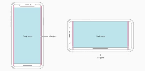
安全エリア
セーフエリアとは、以下の画像のように、角丸やセンサーハウジング、小さな黒いバー(ホームインジケータ)の影響を受けずにコンテンツが表示されるウィンドウ領域のことを指します。
<図
ビューポートフィット
iOS11に追加された新機能、AppleによるiPhoneXの既存への適応について
viewport meta
タグを使用して、Web ページを表示可能なウィンドウにレイアウトする方法を設定することができます。
3つの値
:
<テーブル 値 説明 オート デフォルト値で、containのパフォーマンスと一致します。ページコンテンツはセーフエリア内に表示されます。viewprot-fit:autoはviewport-fit:containと同等です。 含む 表示可能なウィンドウには、ページのコンテンツ(左の画像)が完全に含まれます。ページのコンテンツは安全な領域に表示されます。 viewport-fit:contain カバー ページのコンテンツが可視ウィンドウを完全に覆っている(右画像)。ページの内容が画面いっぱいに表示される。 viewport-fit:cover
定数機能
iOS11の新機能で、セーフエリアとボーダーの距離を設定するWebkit用のCSS関数で、4つの定義済み変数(単位:px)が用意されています。
safe-area-inset-left
safe-area-inset-right
safe-area-inset-top
safe-area-inset-bottom
注意:拡張機能のないページのデフォルトのパフォーマンスはviewport-fit=containで、iPhoneXに合わせるにはviewport-fit=coverを設定する必要があり、そうでない場合は
constant
の機能が動作しないため、適応に必要です。
- 公式ドキュメントでは、将来的にenv()がconstant()に置き換わると言及されているが、これはまだ利用可能ではない
- いずれも webkit では css 関数であり、webkit カーネルのみでサポートされている変数関数をそのまま使用することができます
- constant : iOS < 11.2以下用
- env : iOS >=11.2用
注:拡張機能を持たないウェブページのデフォルトの表現方法は
viewport-fit=contain
に適応させる必要があります。
iPhone
を設定する必要があります。
viewport-fit=cover
というのが適応の重要なステップになります。
アダプテーションの例
ステップ1:表示可能なウィンドウでのページレイアウトを設定する
<meta name='viewport' content="width=device-width, viewport-fit=cover" />
ステップ2:ページ本文の内容を安全な領域に限定する
body {
  /* Adapts to bangs*/
  padding-top: constant(safe-area-inset-top);
 /* fit bottom black bar */
  padding-bottom: constant(safe-area-inset-bottom);
}
ステップ3:固定要素の適応
bottomが0でない場合
/* the case where bottom is not 0 */
.fixed {
  bottom: calc(50px(original bottom value) + constant(safe-area-inset-bottom));
}
底面吸収(bottom=0)の場合
/* Method 1 : Set inner margin Expand height */
/* This option requires that the suction bottom bar must have a background color, because the background of the expanded part follows the outer container, otherwise a skeletonization occurs. */
.fix {
  padding-bottom: constant(safe-area-inset-bottom);
}
/* Directly expand the height */
.fix {
  height: calc(60px(original height value) + constant(safe-area-inset-bottom));
}

/* Method 2: Fill with an empty div below the element, but with the same background color */
.blank {
  position: fixed;
  bottom: 0;
  height: 0;
  width: 100%;
  height: constant(safe-area-inset-bottom);
  background-color: #fff;
}
/* bottom-absorbing element style */
.fix {
  margin-bottom: constant(safe-area-inset-bottom);
}
最後に:@supportsを使用する
前髪があり、下に黒いバーがあるモデルのみスタイルを合わせる必要があるため、@support withを使用することができます。
@supports (bottom: constant(safe-area-inset-bottom)) {
  body {
    padding-bottom: constant(safe-area-inset-bottom);
  }
}
フル検出コード
分離互換モードをサポート
前髪があり、下に黒いバーがあるモデルのみスタイルを適応させる必要があるため、@support withを使用します。
@mixin iphonex-css {
  padding-top: constant(safe-area-inset-top); // is the height of the navigation bar + status bar 88px
  padding-top: env(safe-area-inset-top); // for the height of the navigation bar + status bar 88px
  padding-left: constant(safe-area-inset-left); //0 if not vertical
  padding-left: env(safe-area-inset-left); //0 if not vertical
  padding-right: constant(safe-area-inset-right); //0 if not vertical
  padding-right: env(safe-area-inset-right); //0 if not vertical
  padding-bottom: constant(safe-area-inset-bottom); //is the height of the bottom arc 34px
  padding-bottom: env(safe-area-inset-bottom); //is the height of the bottom arc 34px
}

@mixin iphonex-support {
  @supports (bottom: constant(safe-area-inset-top)) or (bottom: env(safe-area-inset-top)) {
    body.iphonex {
      @include iphonex-css;
    }
  }
}
メディアクエリ
@mixin iphonex-css {
  padding-top: constant(safe-area-inset-top); // is the height of the navigation bar + status bar 88px
  padding-top: env(safe-area-inset-top); // for the height of the navigation bar + status bar 88px
  padding-left: constant(safe-area-inset-left); //0 if not vertical
  padding-left: env(safe-area-inset-left); //0 if not vertical
  padding-right: constant(safe-area-inset-right); //0 if not vertical
  padding-right: env(safe-area-inset-right); //0 if not vertical
  padding-bottom: constant(safe-area-inset-bottom); //is the height of the bottom arc 34px
  padding-bottom: env(safe-area-inset-bottom); //is the height of the bottom arc 34px
}

/* iphonex-adaptation */
@mixin iphonex-media {
  @media only screen and (device-width: 375px) and (device-height: 812px) and (-webkit-device-pixel-ratio: 3) {
    body.iphonex {
      @include iphonex-css;
    }
  }
}
補足
備考
env と constant は viewport-fit=cover のときのみ動作し、上記で使用した Safari コンソールはエミュレータのページでウェブインスペクタがオンであることを検出します。
この記事がお役に立てれば幸いです。また、Scripting Houseを応援していただければ幸いです。
関連
-
html5 モバイル 長押し禁止 画像保存 実装
-
フォントの調整のメニューの右上隅にWeChat内蔵のブラウザでHTML5は、ページが間違った問題を表示するために発生する
-
iframeタグが入れ子になっている問題の解決法
-
html5 自動再生 mov形式動画サンプルコード
-
HTML5 Blobによるファイルダウンロード機能のサンプルコード
-
ホームページのダイナミックな動画背景を実現するHTML5サンプルコード
-
カスタムお絵かきボード用JavaScript+Canvasサンプルコード
-
canvas 学習のまとめ III - パスの描画 - ラインセグメント
-
HTML5サインイン機能
-
HTML5動画再生(動画),JavaScript制御動画サンプルコード
最新
-
nginxです。[emerg] 0.0.0.0:80 への bind() に失敗しました (98: アドレスは既に使用中です)
-
htmlページでギリシャ文字を使うには
-
ピュアhtml+cssでの要素読み込み効果
-
純粋なhtml + cssで五輪を実現するサンプルコード
-
ナビゲーションバー・ドロップダウンメニューのHTML+CSSサンプルコード
-
タイピング効果を実現するピュアhtml+css
-
htmlの選択ボックスのプレースホルダー作成に関する質問
-
html css3 伸縮しない 画像表示効果
-
トップナビゲーションバーメニュー作成用HTML+CSS
-
html+css 実装 サイバーパンク風ボタン