[css3]CSS3アニメーションによるグラフィックドロップ効果
2022-02-02 13:52:27
エフェクトの初見
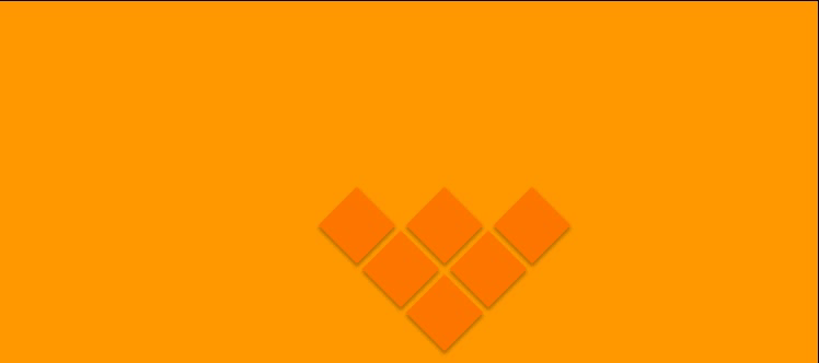
実装コード
<div class="box box1"></div>
<div class="box box2"></div>
<div class="box box3"></div>
<div class="box box4"></div>
<div class="box box5"></div>
<div class="box box6"></div>
* {
  margin: 0;
  padding: 0;
  box-sizing: border-box;
}
body {
  width: 100%;
  height: auto;
  background: #f90;
  overflow: hidden;
}
.box {
  width: 50px;
  height: 50px;
  background: #f70;
  transform: rotate(45deg);
  position: absolute;
  box-shadow: 2px 2px 3px rgba(0, 0, 0, 0, 0.3);
}
.box1 {
  left: calc(50% - 25px);
  top: calc(100% - 75px);
  animation: box1 cubic-bezier(1, 0, 0.45, 1.4) 2s 1;
}
.box2 {
  left: calc(50% - 65px);
  top: calc(100% - 115px);
  animation: box2 cubic-bezier(1, 0, 0.45, 1.4) 2.5s 1;
}
.box3 {
  left: calc(50% + 15px);
  top: calc(100% - 115px);
  animation: box3 cubic-bezier(1, 0, 0.45, 1.4) 3s 1;
}
.box4 {
  left: calc(50% + 55px);
  top: calc(100% - 155px);
  animation: box4 cubic-bezier(1, 0, 0.45, 1.4) 3.5s 1;
}
.box5 {
  left: calc(50% - 105px);
  top: calc(100% - 155px);
  animation: box5 cubic-bezier(1, 0, 0.45, 1.4) 4s 1;
}
.box6 {
  left: calc(50% - 25px);
  top: calc(100% - 155px);
  animation: box6 cubic-bezier(1, 0, 0.45, 1.4) 4.5s 1;
}
@keyframes box1 {
  from {
    top: -100px;
  }
  to {
    top: calc(100% - 75px);
  }
}
@keyframes box2 {
  from {
    top: -100px;
  }
  to {
    top: calc(100% - 115px);
  }
}
@keyframes box3 {
  from {
    top: -100px;
  }
  to {
    top: calc(100% - 115px);
  }
}
@keyframes box4 {
  from {
    top: -100px;
  }
  to {
    top: calc(100% - 155px);
  }
}
@keyframes box5 {
  from {
    top: -100px;
  }
  to {
    top: calc(100% - 155px);
  }
}
@keyframes box6 {
  from {
    top: -100px;
  }
  to {
    top: calc(100% - 155px);
  }
}
上記は、CSS3グラフィックドロップのアニメーション効果の詳細であり、CSS3グラフィックドロップに関する詳細な情報は、スクリプトの家の他の関連記事に注意を払うしてください
関連
-
[CSSチュートリアル]CSSで簡単!高周波な異形ボタンを実現する方法
-
[CSSチュートリアル】純粋なCSSでWebページの内容をコピーできないようにする方法
-
[CSSチュートリアル】 css border add four corners コード
-
[CSS3] CSS3リスト無限スクロール/回転効果
-
[CSSチュートリアル】CSSで実現するイメージマッピングメソッド
-
[CSSチュートリアル】子要素のmargin-topが親要素の移動を引き起こす問題解決
-
[CSSチュートリアル]実装ステップの吸引上部と下部のH5レイアウトのための純粋なCSSソリューション
-
[CSSチュートリアル】大きな画像や情報を小さなドロップダウンで実現するCSS
-
[css3]css3は、最初と最後のテキスト実行例を実現するためのコード
-
[CSSレイアウト例】フレックスレイアウトを使って簡単にページレイアウトを実現するサンプルコード
最新
-
nginxです。[emerg] 0.0.0.0:80 への bind() に失敗しました (98: アドレスは既に使用中です)
-
htmlページでギリシャ文字を使うには
-
ピュアhtml+cssでの要素読み込み効果
-
純粋なhtml + cssで五輪を実現するサンプルコード
-
ナビゲーションバー・ドロップダウンメニューのHTML+CSSサンプルコード
-
タイピング効果を実現するピュアhtml+css
-
htmlの選択ボックスのプレースホルダー作成に関する質問
-
html css3 伸縮しない 画像表示効果
-
トップナビゲーションバーメニュー作成用HTML+CSS
-
html+css 実装 サイバーパンク風ボタン
おすすめ
-
[CSSチュートリアル】CSS+HTMLで実現するトップナビゲーションバー機能
-
[css3]css3はtransform-originを使用して、大きな円上のドット分布のレイアウトと回転を実現します。
-
[css3]css3は、3つの方法のサンプルコードのテキストの点滅効果を達成するために
-
[CSSチュートリアル】空間均等性の問題を解決する2つの方法
-
[CSSチュートリアル】カラフルで知的なシャドウ効果を実現するCSS
-
[CSSチュートリアル]overflow:autoの使い方解説
-
[CSSチュートリアル】SCSS50%スタイルコード削減のための14の実践レッスン
-
[CSSレイアウト例】6種類の適応的な2カラムレイアウトを実現するCSS
-
左上または右上にリマインダーのドットを表示するCSS3サンプルコード[CSSチュートリアル
-
[CSSチュートリアル】display:olck/noneでメニューバーを完成させる方法