[CSSチュートリアル]アダプティブスクエアを実現するCSSの例
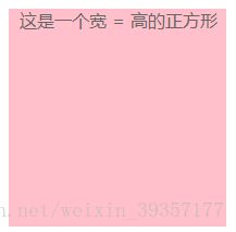
従来の正方形の書き方は、以下のように長さ=幅を直接固定値で書いていました。
.box{
		width: 200px;
		height: 200px;
		background: pink;
		color: #666;
	}
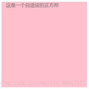
しかし、モバイルデザインではモバイル端末によって画像の幅が変わるケースが多いため、アダプティブスクエアの実装が必要です。
ここでは、よりシンプルな方法を2つ紹介します。
方法1 CSS3のvw単位で、vwはビューポートに対する相対的な幅です。ビューポートは100単位のvwに均等に分割される。1vw = 1%のビューポート幅
.box{
		width: 20%;//width:20vw is fine
		height: 20vw;
		background: pink;
	}
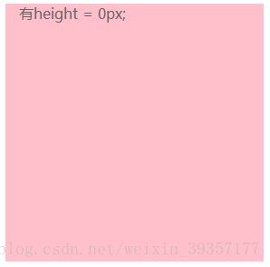
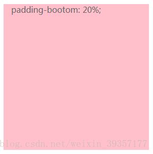
方法2 ボックスのpadding-bottomのスタイルがボックスの幅と同じになるように設定し、height = 0pxを設定します。
<!DOCTYPE html>
<html>
<head>
<meta charset="utf-8">
<meta http-equiv="X-UA-Compatible" content="IE=edge">
<title></title>
<link rel="stylesheet" href="">
</head>
<style>
*{
margin: 0;
padding: 0;
}
.box{
width: 20%;
/* Set the height to 0 to avoid the box from being stretched out by the content */
height: 0px;
/* set the height of the box to
Set the same fixed width or percentage as width.
The percentage is relative to the width of the parent's box */
padding-bottom: 20%;
background: pink;
color: #666;
}
</style>
<body>
<div class="box">
<p> This is an adaptive square</p>
</div>
</body>
</html>
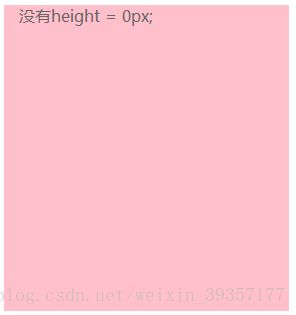
ここで height: 0px; と書かないと、ボックスの中にコンテンツがあるとき、コンテンツによってボックスが膨らんでしまうので注意しましょう。
padding-bottomをpadding-topに変更するとどうなりますか?
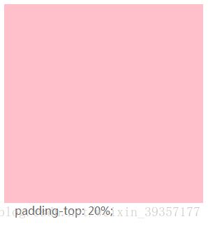
正方形の中にコンテンツがある場合、コンテンツは正方形の外側になることがわかります。デフォルトのテキストは左から右、上から下へと配置されるので、paddin-topの後にテキストが正方形の外側になるため、ここではpaddin-bottomとpadding-topは混在していないのです
また、ボックスの高さが設定されているため
:
0px;の中に子要素がある場合、高さを正しく設定することができません。そこで
position: absolute; so that the current content out of the document flow, then the content of the height of the percentage reference to the parent's width
*{
	margin: 0;
	padding: 0;
}
.box{
	width: 20%;
	/* Set the height to 0 to avoid the box from being stretched out by the content */
	height: 0px;
	/* set the height of the box to
	   Set the same fixed width or percentage as width.
	   The percentage is relative to the width of the parent's box */
	padding-bottom: 20%;
	background: pink;
	color: #666;
	position: relative;
	overflow: hidden;
}
p{
	position: absolute;
	width: 100%;
	height: 100%;
	background: yellow;
}
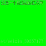
こうすることで、ボックスの中身が正方形でいっぱいになります
CSSで適応型正方形を実現する方法について紹介したこの記事は、より関連するCSS適応型正方形のコンテンツは、スクリプトハウスの過去の記事を検索するか、次の関連記事を引き続き閲覧してください、私はあなたがより多くのスクリプトハウスをサポートするために今後を願っています!。
関連
-
[CSSチュートリアル】 css border add four corners コード
-
[css3]CSS3タブアニメーションの背景切り替えの動的効果例
-
[CSSチュートリアル】CSS擬似要素::マーカー解説
-
[CSSチュートリアル]cssの位置固定コードで左右2重の位置決め
-
[CSSチュートリアル]CSS動的高さ遷移のアニメーション効果の実装の
-
[css3]スクロールバー美化効果を実現するcss3サンプルコード
-
[ブラウザ互換性チュートリアル]IE9でのネイティブページの互換性問題の解決方法について
-
[CSSチュートリアル]overflow:autoの使い方解説
-
左上または右上にリマインダーのドットを表示するCSS3サンプルコード[CSSチュートリアル
-
[CSSチュートリアル】css3 背景画像 半透明 コンテンツ 不透明 方法例
最新
-
nginxです。[emerg] 0.0.0.0:80 への bind() に失敗しました (98: アドレスは既に使用中です)
-
htmlページでギリシャ文字を使うには
-
ピュアhtml+cssでの要素読み込み効果
-
純粋なhtml + cssで五輪を実現するサンプルコード
-
ナビゲーションバー・ドロップダウンメニューのHTML+CSSサンプルコード
-
タイピング効果を実現するピュアhtml+css
-
htmlの選択ボックスのプレースホルダー作成に関する質問
-
html css3 伸縮しない 画像表示効果
-
トップナビゲーションバーメニュー作成用HTML+CSS
-
html+css 実装 サイバーパンク風ボタン
おすすめ
-
cssで背景色の半透明化を実現する2つの方法
-
[CSSチュートリアル】純粋なCSSでWebページの内容をコピーできないようにする方法
-
[CSSチュートリアル】CSSでemを開く正しい方法 詳細へ
-
[CSSチュートリアル]モバイルにおけるviewportの具体的な使い方
-
[CSSチュートリアル]css transform ページめくりアニメーションの記録
-
[css3] 翻訳効果のあるcss3例(翻訳:translate)
-
[css3】background属性の8つの属性値について解説(インタビュー記事)
-
[css3]CSS 3.0テキストホバー飛び効果コード
-
[CSSチュートリアル]cssで背景画像の上にテキストを実現する
-
[CSSチュートリアル] Pure CSS to click to expand もっと読む