[CSSチュートリアル]マウスをスライドさせてカードを浮かせるCSSの例
原理
ホバーリング時に要素にシャドウ:box-shadowを設定し、通常とは異なる見え方をさせる。
ボックスシャドウの表現については MDN :
/* x-offset | y-offset | shadow-color */
box-shadow: 60px -16px teal;

/* x-offset | y-offset | shadow-blur radius | shadow-color */
box-shadow: 10px 5px 5px black;

/* x-offset | y-offset | shadow-blur radius | shadow-spread radius | shadow-color */
box-shadow: 2px 2px 2px 1px rgba(0, 0, 0, 0.2);

/* inset(inward) | x-offset | y-offset | shadow-color */
box-shadow: inset 5em 1em gold;

/* Any number of shadows, separated by commas */
box-shadow: 3px 3px red, -1em 0 0.4em olive;
box-shadow を 1 つだけ使用するように指定する。
- 2つ、3つ、または4つの数値を与える。
2つの値のみを指定した場合、ブラウザはその2つの値をX軸のオフセットとY軸のオフセットとして解釈します。
3つ目の値が指定された場合、この3つ目の値はぼかし半径のサイズとして解釈されます。
4番目の値が指定された場合、この4番目の値は拡張半径の大きさとして解釈される。
- オプションで、inset(内側に影がつく)インセット。
- オプションで、カラーバリュー.
このブログシステムでも何度も使用されているスタイルを以下にリストアップします。
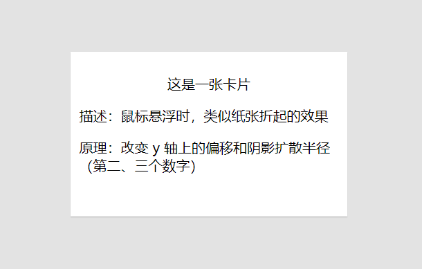
I. マウスホバーで紙折りスタイルを模倣する
コードの実装。
を追加しました。
transition
属性をホバー状態に設定し、フェード効果を演出しています。
<!DOCTYPE html>
<html lang="en">
<head>
  <meta charset="UTF-8">
  <title>Mouse hover imitates paper folding up style</title>
</head>
<style type="text/css">
  /* Core styles */
  .card {
    width: 300px;
    height: 180px;
    border: 10px solid #FFF;
    border-bottom: 0 none;
    background-color: #FFF;
    box-shadow: 0 1px 1px 0 rgba(0, 0, 0, .15)
  }

  .card:hover {
    box-shadow: 0 5px 5px 0 rgba(0, 0, 0, .25);
    transition: all .2s ease-in-out;
  }

  /* Non-core styles */
  .card-header {
    text-align: center;
  }

  .card-body, .card-footer {
    text-align: left;
  }
</style>
<body style="background: #e3e3e3;">
<div class="card">
  <div class="card-header">
    <p>This is a card</p>
  </div>
  <div class="card-body">
    <p> Description: A paper-fold-like effect when the mouse hovers</p>
  </div>
  <div class="card-footer">
    <p> Principle: Change the offset and shadow spread radius on the y-axis (second and third digits)</p>
  </div>
</div>
</body>
</html>
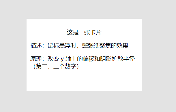
第二に、マウスホバーは紙のフォーカスのスタイルを模倣しています
コードの実装。
上と違うのは、調整することで
box-shadow
属性(Y軸上のオフセットと影の広がりの半径、つまり2番目と3番目の数値)を指定します。
<!DOCTYPE html>
<html lang="en">
<head>
  <meta charset="UTF-8">
  <title>Mouse hover imitates paper focus style</title>
</head>
<style type="text/css">
  /* Core styles */
  .card {
    padding: 10px;
    width: 300px;
    height: 180px;
    background-color: #FFF;
    box-shadow: none;
  }

  .card:hover {
    box-shadow: 0 1px 6px 0 rgba(0, 0, 0, .2);
    border-color: #eee;
    transition: all .2s ease-in-out;
  }

  /* Non-core styles */
  .card-header {
    text-align: center;
  }

  .card-body, .card-footer {
    text-align: left;
  }
</style>
<body style="background: #e3e3e3;">
<div class="card">
  <div class="card-header">
    <p>This is a card</p>
  </div>
  <div class="card-body">
    <p> Description: The effect of focusing the entire sheet of paper when the mouse hovers</p>
  </div>
  <div class="card-footer">
    <p> Principle: Change the offset and shadow spread radius on the y-axis (second and third digits)</p>
  </div>
</div>
</body>
</html>
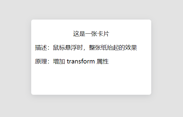
3、マウスホバーでペーパーリフトのスタイルを模倣する
コードの実装。
によって
box-shadow
属性と
transform
属性が組み合わされます。
<!DOCTYPE html>
<html lang="en">
<head>
  <meta charset="UTF-8">
  <title>Mouse hover imitates paper lift style</title>
</head>
<style type="text/css">
  /* Core styles */
  .card {
    padding: 10px;
    width: 300px;
    height: 180px;
    background-color: #FFF;
    border: none;
    border-radius: 6px;
    -webkit-transition: all 250ms cubic-bezier(0.02, 0.01, 0.47, 1);
    transition: all 250ms cubic-bezier(.02, .01, .47, 1);
  }

  .card:hover {
    box-shadow: 0 16px 32px 0 rgba(48, 55, 66, 0.15);
    transform: translate(0,-5px);
    transition-delay: 0s !important;
  }

  .box-shadow {
    -webkit-box-shadow: 0 0.25rem 1rem rgba(48, 55, 66, 0.15);
    box-shadow: 0 4px 16px rgba(48, 55, 66, 0.15);
  }

  /* Non-core styles */
  .card-header {
    text-align: center;
  }

  .card-body, .card-footer {
    text-align: left;
  }
</style>
<body style="background: #e3e3e3;">
<div class="card box-shadow">
  <div class="card-header">
    <p>This is a card</p>
  </div>
  <div class="card-body">
    <p> Description: The effect of lifting the whole sheet of paper when the mouse hovers</p>
  </div>
  <div class="card-footer">
    <p> Principle: add transform attribute</p>
  </div>
</div>
</body>
</html>
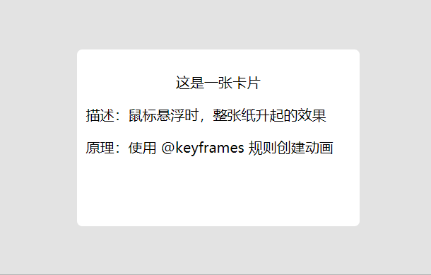
4、マウスホバーで紙が舞い上がるスタイルを模倣(アニメーションの実装)
コードの実装。
を使用することで
@keyframes
ルールを使って、ある CSS スタイルのセットを徐々に別のものに変えていくアニメーションを作成します。
ホバー状態でアニメーションを実行する。
<!DOCTYPE html>
<html lang="en">
<head>
  <meta charset="UTF-8">
  <title>Mouse hovering imitates the style of paper rising</title>
</head>
<style type="text/css">
  /* Core styles */
  .card {
    padding: 10px;
    width: 300px;
    height: 180px;
    background-color: #FFF;
    border: none;
    border-radius: 6px;
    -webkit-transition: all 250ms cubic-bezier(0.02, 0.01, 0.47, 1);
    transition: all 250ms cubic-bezier(.02, .01, .47, 1);
  }

  .card:hover {
    animation: fly 0.0001s linear;
    animation-fill-mode: both;
  }

  @keyframes fly {
    0% {
      box-shadow: 2px 2px 2px #e2dede, -2px 2px 2px #e2dede;
    }
    100% {
      box-shadow: 6px 8px 12px #e2dede, -6px 8px 12px #e2dede;
    }
  }

  /* Non-core styles */
  .card-header {
    text-align: center;
  }

  .card-body, .card-footer {
    text-align: left;
  }
</style>
<body style="background: #e3e3e3;">
<div class="card box-shadow">
  <div class="card-header">
    <p>This is a card</p>
  </div>
  <div class="card-body">
    <p> Description: The effect of the entire sheet of paper rising when the mouse hovers</p>
  </div>
  <div class="card-footer">
    <p> Principle: Create animations using the @keyframes rule</p>
  </div>
</div>
</body>
</html>
上記は、カードフローティングエフェクトの例の上にマウスのスライドを達成するためのCSSの詳細であり、カードフローティング効果の上にマウスのスライドを達成するためのCSSに関する詳細については、スクリプトホームの他の関連記事に注意を払うしてください
関連
-
[CSSチュートリアル]CSSで簡単!高周波な異形ボタンを実現する方法
-
[CSSチュートリアル]z-indexの違い。cssのz-index: 0とz-index: autoの違い。
-
[CSSチュートリアル]css display table adaptive height, widthの問題解決
-
[CSSチュートリアル】CSSで実現するTikTokのテキストジッター効果例
-
[CSSチュートリアル]CSS気まぐれボーダーアニメーション効果
-
[CSSチュートリアル】カラフルで知的なシャドウ効果を実現するCSS
-
[CSSチュートリアル】大きな画像や情報を小さなドロップダウンで実現するCSS
-
[css3]css3 elastic box flexによる3カラムレイアウトの実装。
-
[CSSチュートリアル】CSS擬似クラス:empty makes my eyes shine(コード例)
-
[CSSチュートリアル】Chromeのフォント最小12px制限の最終解決策
最新
-
nginxです。[emerg] 0.0.0.0:80 への bind() に失敗しました (98: アドレスは既に使用中です)
-
htmlページでギリシャ文字を使うには
-
ピュアhtml+cssでの要素読み込み効果
-
純粋なhtml + cssで五輪を実現するサンプルコード
-
ナビゲーションバー・ドロップダウンメニューのHTML+CSSサンプルコード
-
タイピング効果を実現するピュアhtml+css
-
htmlの選択ボックスのプレースホルダー作成に関する質問
-
html css3 伸縮しない 画像表示効果
-
トップナビゲーションバーメニュー作成用HTML+CSS
-
html+css 実装 サイバーパンク風ボタン
おすすめ
-
[CSSチュートリアル】CSSを解析して、画像のテーマカラー機能を抽出する(コツ)
-
[css3]css3はtransform-originを使用して、大きな円上のドット分布のレイアウトと回転を実現します。
-
[Div+CSSチュートリアル】divの背景を透明にする設定例
-
[css3]赤いパケットのジッター効果を実現するCSS3
-
フロントエンドの落とし穴 リソースはスタイルシートとして解釈されるが、MIMEタイプはtext/htmlで転送される。"<URL>". css スタイルの失敗
-
[css3]CSS3は本当にSCSSに取って代わるのだろうか?
-
[CSSチュートリアル]CSS線形グラデーションの凹型矩形遷移の動的効果
-
[css3】cssのmarginとvertical marginの重なりの値について
-
[css3]CSS 3.0テキストホバー飛び効果コード
-
[CSSレイアウト例】フレックスレイアウトを使って簡単にページレイアウトを実現するサンプルコード